Filson: An American Tale

There are a tremendous number of catalogs out there, spanning the arc from breathtaking all the way to ‘this could use a little work’. I wanted to take a moment and talk about “Filson”, a brand that has flirted around the peripherals of my upscale workwear interests, but that I had not seen a paper product from in years. Filson is Americana to its core. Founded in Seattle in the 1890’s (and still headquartered there), it became a bastion for durable and reliable workwear, outerwear, bags, luggage and everything in between.
Within this post I will highlight three things Filson is doing well in their catalog, and three things they might be able to improve on. Here’s hoping my review allows you to look at your own catalog with new eyes and a fresh perspective.
In a world (and market) awash in digital communication, we create captivating and persuasive catalogs for our clients by always beginning a project with three key goals: “Disrupt. Delight. Drive.” Make the piece stand out, make it delight the reader, and drive people to act. If you can accomplish these three essential tasks and be a brand that feels human; well, you may have a great book on your hands.
Three things Filson is doing well:
1). The Epitome of Lifestyle
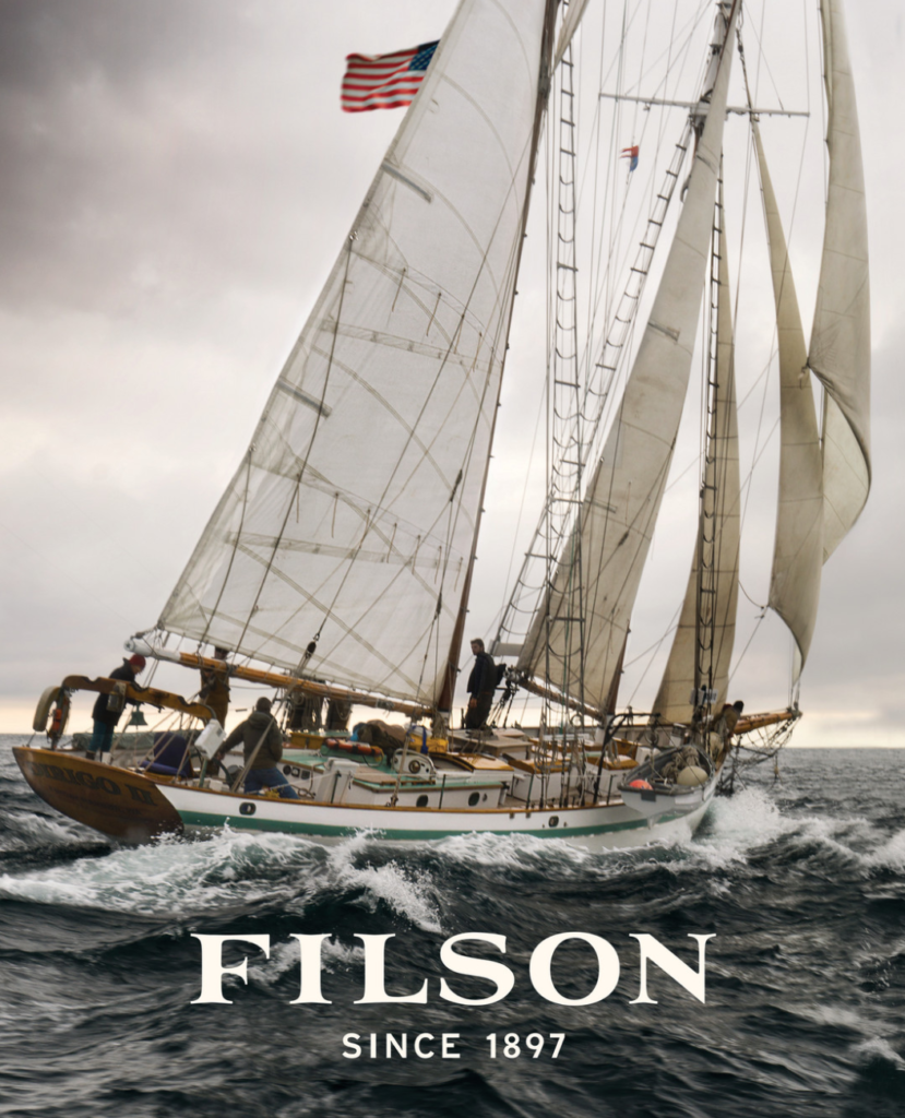
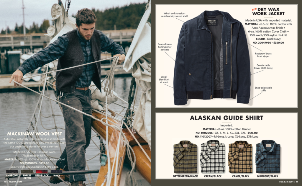
Filson portrays American life, and your place in it, with such romantic flourish that it won’t take much to convince yourself you need an Alaskan Guide Shirt in 4 colorways and a weatherproof Tin Cruiser for your subway commute. Every cover features rugged scenes of work and exploration, from the ranch to the sea, juxtaposed against an elegant and versatile sans serif typeface that embraces the new west, without forgetting the old. It immediately draws you in with curiosity and the promise of adventure. Within its pages you’ll see their upscale and fashionable workwear being put to the test, from carpenters and sail-makers to wranglers and mechanics, they will be clad head-to-toe in Filson. After just a few pages you’ll start to see yourself in their clothing, carrying their duffels, as you head off into the sunset, leaving your corporate gig to pick up your long-lost mantle as a stoic maritime deck-hand.

2). The Pragmatic Storyteller
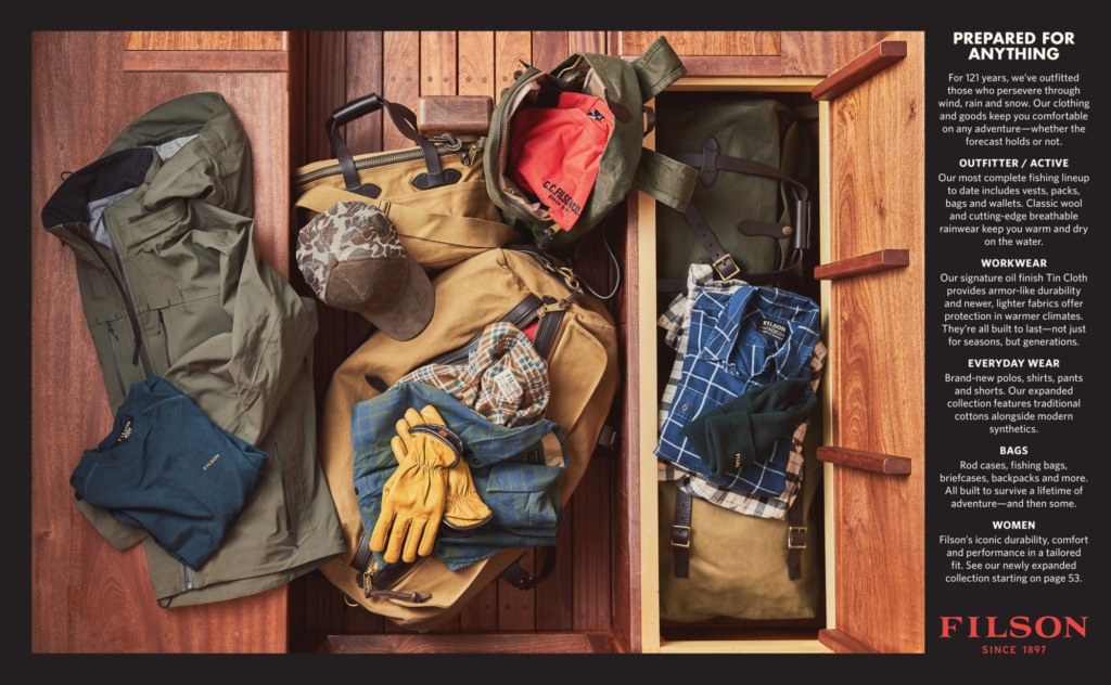
As marketers, especially ones who specialize in catalogs, we know the importance of pages two and three (the opening spread). The cover and paper quality have successfully caused a disruption in the mailbox and now the audience has opened to that first essential selling opportunity. For many companies this can be an arena where brand story, product breakdowns, and initial calls-to-action battle for prevalence and hierarchy. Filson flips this model on its head, letting their products lead, telling their story through visual arrangement and design, while relying on spartan and engaging copy to fill in the gaps.

They array their clothing and accessories to showcase a little bit of everything, letting the inclusion of casual tees next to rawhide gloves overlaid on a ships cabin storage do all the explaining they need. Next to the product spread there is a brief brand message, highlighting the history and reminding customers how they are different and what they offer. This is workwear, for however and wherever you want to wear it.
3). The Voice of C.C. Filson
From T-Shirts emblazoned with “Might As Well Have The Best” to the iconic Filson Guarantee found in every catalog and online, the modern Filson brand may look a little different than it did 124 years ago, but it sure sounds the same (in the best way). While the company hasn’t been owned by the Filson family or its appointees since 1970, the voice of founder Clinton C. Filson echoes from the original general stores of the 1890’s through the company today.
In the spirit of a select few other outdoor/lifestyle brands the Filson guarantee reassures customers that if a “Filson item fails or is damaged, [they will] repair or replace it without question.” For a company that bridges the gap between true outdoor workwear and a high fashion attitude and price point (think Carharrt WIP, The Best Made Co., etc) a reliable guarantee of repair built on the original wishes of the founder can be the final push a customer needs to make a purchase.
Three things Filson could do better:
1). Made in America?
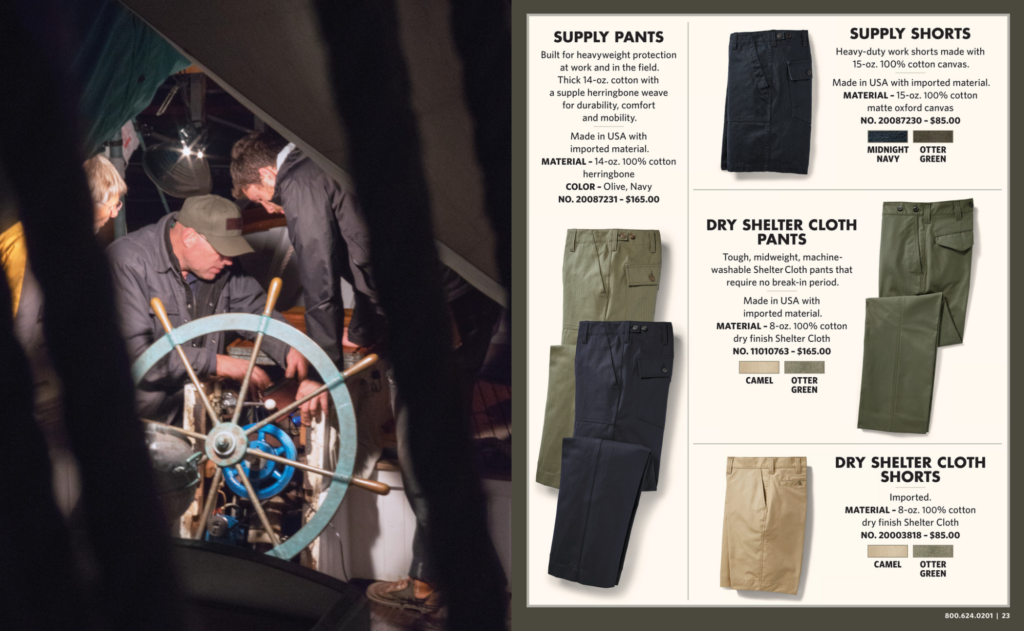
This one’s tricky. Like many other brands Filson sources its products from a variety of places, some at home and some abroad. Within the catalog their clothing and accessories can be broken down into two main categories: “Made in USA with imported material” & “Imported”. While I understand that drawing extra attention to the products made in the USA will naturally also shine a similar level of focus on those that aren’t, for a company that builds much of its cache off of its historic American roots I think they are missing an opportunity in print.

A sizable portion of their inventory is still constructed in their flagship Seattle factory which happens to be in a beautiful (and customer facing) historic building. It’s where you send products for repair, it’s where their duffels and overcoats are stitched and sewn by talented craftspeople, and in my view, it’s where Filson truly becomes Filson. In a market where it is becoming ever-harder to source American made products and in a catalog that already lends itself to lifestyle photography, there is an opportunity to tell a currently downplayed (or missing) part of the Filson story.
2). The Balancing Act
As we saw earlier, Filson is a champion of lifestyle photography and design in their catalog, but like most things in life it comes as a compromise. Many products are featured in full page hero images showcasing the clothing item as it could be practically used. While this is striking, it often comes as a disservice to important product details, especially in regards to alternative colorways. Instead of allocating space to showcase more product options the catalog leaves little room to demonstrate varying patterns and colors. This decision can make it difficult for consumers to envision other styles and as such might limit purchases. No catalog can do it all and, in the end, it will come down to finding a healthy balance of lifestyle photography and product photography, especially when considering new items or best sellers.

3). Keep Pushing
Critiquing progress for not being progressive enough is always a difficult place to find oneself, regardless of the subject matter. So, I want to begin this section by noting that in an area of fashion often dominated by masculine brands and styles Filson’s inclusion of a women’s clothing line is better than an absence of one – but they could be doing even more.
At the end of the Filson catalog, readers will find a sudden seven page drop of women’s clothing. While it is mentioned on page three, after 50 or so pages of browsing, and with no introduction, it seems somewhat out of place. The lifestyle photography is there, the quality is there, but compared with the sheer size of the men’s section it can’t help feel a little like an afterthought.

As an initial solution, the women’s line could be better introduced and expanded to include more styles and options, such as those currently available on their website and in brick-and-mortar locations. With that said, I haven’t seen their demographic numbers or research, so assuming there is a data driven reason for the length of the women’s clothing section I want to suggest one other alternative. Instead of tucking this section in the back of the book, weave it throughout the entirety of the catalog. Switch up the lifestyle photography to include both women and men, then showcase both products on a spread highlighting the cut and styling of the women’s version. Make it feel cohesive and, above all, purposeful.
One final method for alleviating this problem has been proven in direct marketing over and over again. It is the inclusion of a ‘miniature catalog’ for lack of a better term, that is bound into the center of the main book. The middle spread of the entire Filson catalog opens, and inside readers can find a smaller catalog devoted just to women. The paper size might be smaller, but a book within a book, always makes an impact. It immediately disrupts the typical catalog experience, it delights readers to find a section curated just for them, and of course, if done well, it drives them online.
—
Overall Filson makes a tremendous book. There is a good reason it has been landing in mailboxes for over 100 years. They tell a compelling story about themselves that extends to the reader, for just a little while you get to dabble in the life unlived: riding the trails, sailing the seas, or simply buying a new chore coat for those brisk morning commutes.
Looking to improve your own catalog, or just talk about the importance of story telling in your book? Reach out to devonc@jschmid.com.
Read More Catalog Critiques:
Tags: catalog, catalog creative, catalog critiques, catalog design, copywriter, Devon Clements, Filson, marketing strategy


