
Olive & Cocoa: Draw Your Shoppers In

I’m a sucker for an illustrated cover, even when I’m not in the target audience – J. Peterman, Duluth Trading Company. There’s something about the artisanship, timelessness and unique look that calls to me and makes me want to see what’s behind it.
At J.Schmid, we like to say that the best catalogs DISRUPT, DELIGHT and DRIVE. And every time the delightful Olive & Cocoa catalog crosses my path, I’m so charmed by their elegant yet whimsical illustrations that I’m pulled from what I’m doing – one might say disrupted – and dig in. Inside its pages, I find a lot to love. But…I’m also left wanting something more. I haven’t yet been driven to take action, to visit the website, to place an order.
So what’s missing? As a shopper I crave a more curated experience, more story, more drama. I want to be drawn in to the catalog, just as I’m drawn in to the cover. That’s what’s going to drive me and other shoppers to the critical step where I become a customer.
But to be fair, they do a lot more right than wrong. So let’s start with the good.
Three things Olive & Cocoa does well:
FRONT COVERS
The hallmark of Olive & Cocoa’s catalog covers are a charming, illustrated scene featuring two characters – one presumes they are Olive & Cocoa. The elegant yet whimsical style stands out and fulfills the biggest need of the catalog cover – grab attention to get the reader inside the catalog.
In addition, an effective cover should state any offers: An “offer” doesn’t necessarily mean discount or promotion; it can simply mean the selling proposition. In this case, they’re not offering dollars off, as is common with higher-price point brands, they are communicating their selling proposition of unique “textures of the imagination.” Check.
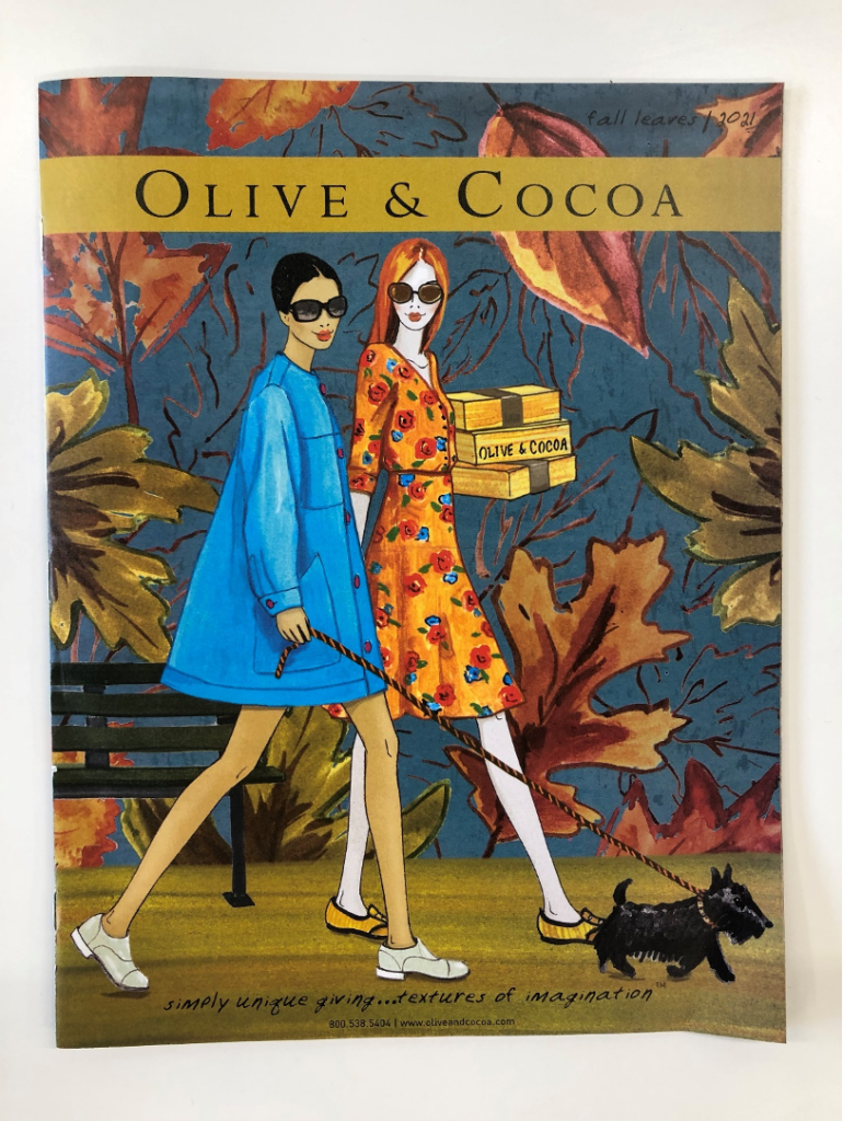
Finally, catalog covers need to tell who you are, in both the literal and figurative sense. They use a traditional masthead here, and repeat it on the stack of gift boxes within the illustration, so…check. But more than that, they have an unmistakable style. Which is a great example of differentiation:
DIFFERENTIATION
Because of the unique style, I could recognize an Olive & Cocoa cover from across the room, which means they’ve already accomplished something that’s difficult to do: be different in a sea of sameness. They’re imaginative, playful, celebratory, sophisticated and high-end. And the copy carries this voice throughout the catalog, the illustrations throughout the catalog, making it easy to feel their unique brand differentiation.
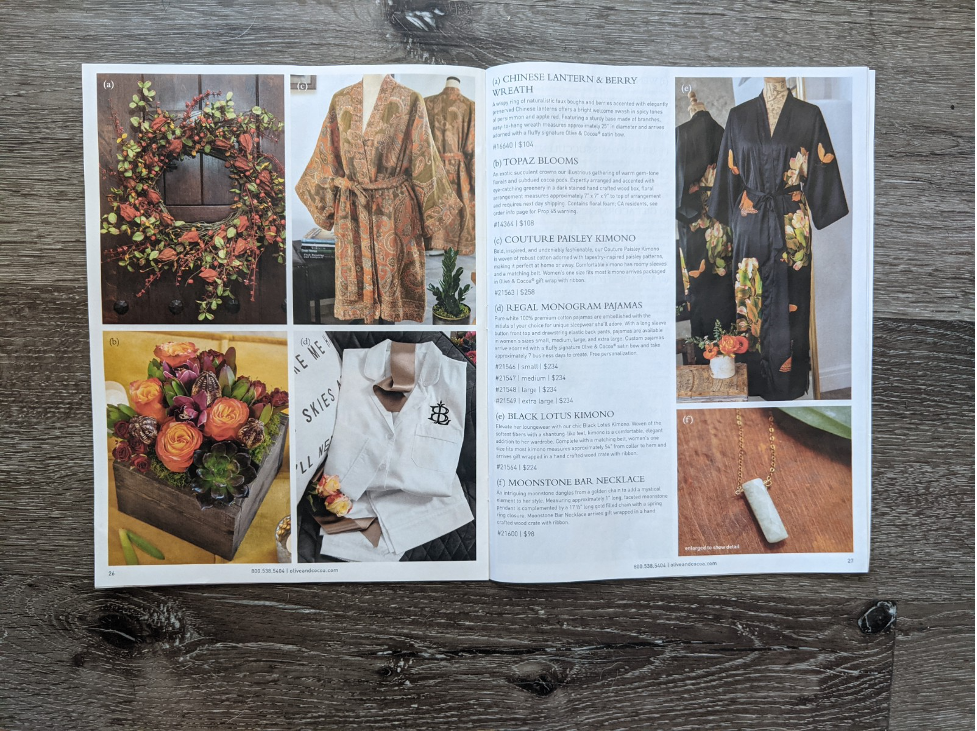
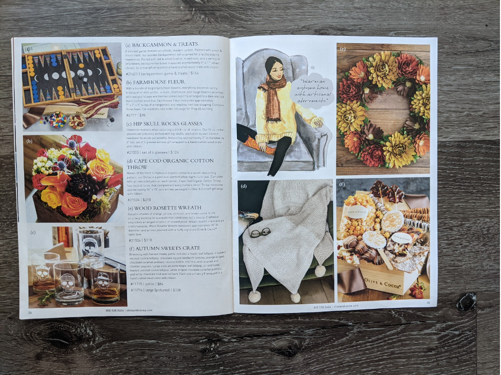
PRODUCT SHOPPING
Finally, on an individual product level, the shoppability is easy in this catalog. The photography is high quality and appealing, the key coding is clear, copy is on-brand with its whimsy and imagination, while providing enough detail, which is a hard balance to strike. Things are easy to understand.
However, no catalog is perfect and there’s some opportunities to improve here.
Three things Olive & Cocoa could do better:
HEROES/ DRAMA
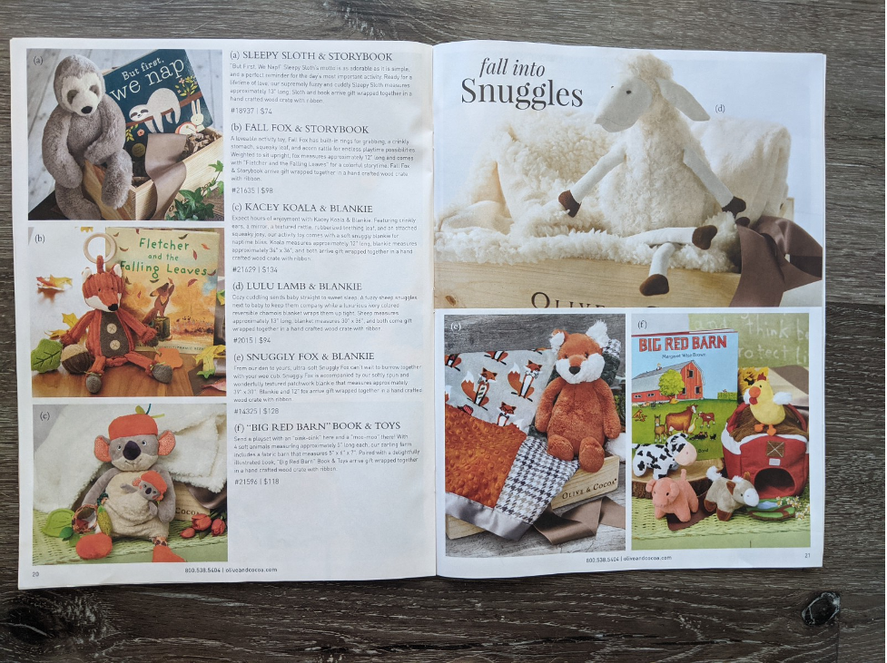
Use of heroes to create drama/ pacing. The biggest weakness of this catalog is its too-democratic treatment of all the products. First, is to help the customer shop, and to simply create stopping power. A catalog is a curated experience, it should draw attention to the proven winners: your flagship items, best-sellers and customer favorites. There’s just not enough to direct attention here, although there are some attempts with “half page” heroes. They don’t go far enough in the drama of the creative presentation and to use scale, placement in hot spots and callouts.
Placing the same emphasis on each item is the equivalent of having a customer walk into a brick and mortar store, and when they ask the sales person about the best and most popular products, they say “Just look around.”
The language, while evocative, strikes a passive tone most of the time. The two strongest calls to action throughout are “Share gifts of magic and wonder” and “Scan to shop our mobile website!” so there’s a lot more opportunity here to engage customers, to give them a reason to visit the site via a strong call-to-action – whether it’s to see the full Fall collection, to browse new arrivals or to put a custom-brand on a gift box.
PACING / VARIETY
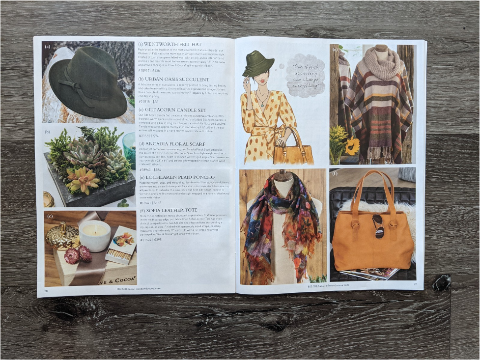
Second, when the spreads all look so similar it’s just not that interesting. It doesn’t fulfill the promise of their charming and unique covers.
From a design perspective, most pages feel very gridded, modular and a little paint-by-number. Even the illustrations that harken back to the cover fit neatly into a similarly sized box every time, only their placement on the spread varies. I’d love to see them weave in the illustration in a tall-sidebar, or change up the crop and angle on their photography by including a whole-room scene with multiple products and making it a full page or spread hero.
ORGANIZATION
The organization isn’t immediately clear – food gifts, apparel, accessories, home goods and plants are all sprinkled throughout the catalog. However, a closer perusal reveals the themed spreads based around a visual similarity or mood. Themed spreads are powerful storytelling, and I’m sure these themes are crystal clear to those that worked on the catalog, as they became to me once I started to see the organization. I could see that there’s a “fun” spread, a “serene” spread an “elegant” one, and so on. The issue is that I need to spend time to visually process each spread before I started to get it. This may serve their die-hard customers well, but more casual customers or prospects aren’t likely to spend as much time with it. Most catalog shoppers look at the cover (front or back) do a quick flip through the pages, and if nothing catches their attention immediately they’ll set it aside and won’t pick it up again until they set it in the recycle bin.
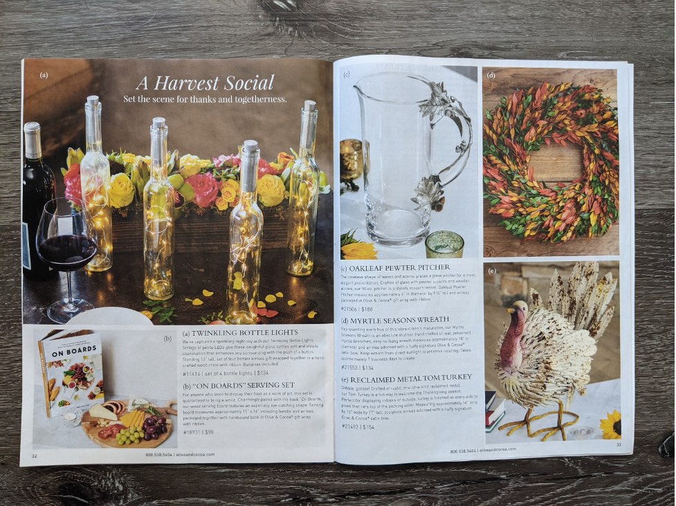
The copy could be working harder to convey the themes and pull the emotional hook together. This is most easily done using headlines and subheads. In fact, this is well done on the “Harvest Social” spread, which is clearly about fall entertaining. They understand it in theory, so it would really help if they employed this technique throughout rather than just twice.
This catalog has so much promise it almost hurts. They have a unique design perspective, a well-established and unique personality – I just want to see them take it to the next level, increase the drama and make the call-to-action more active. I want more storytelling to really bring it all together.
Does your catalog need some help driving to the next order? We can help! Email laurena@jschmid.com.
Read More Catalog Critiques:


Tags: catalog, catalog creative, catalog critiques, catalog design, Duluth Trading Company, marketing strategy, Michele Drohan