
Duluth Trading Company

It’s my turn to chime in as part of our critique series, where we assess catalogs with an eye for the “Three D’s: DISRUPT, DELIGHT and DRIVE. Does the catalog stand out and grab my attention (Disrupt)? Does the book engage me somehow (Delight)? Does it encourage me to go online or to the store, to learn more, engage or shop (Drive)?
I picked up the venerable Duluth Trading Company catalog—one that came to my mailbox earlier this summer. Does it Disrupt, Delight and Drive? Of course, it does. It’s Duluth! One needs only to be in the direct marketing business for about 4 minutes to recognize that they are masters. The OG of catalogers. But even a catalog that is held in such high regard has room for improvement.
THREE CHEERS FOR DULUTH’s CATALOG
- Real Women. Real Ambition.
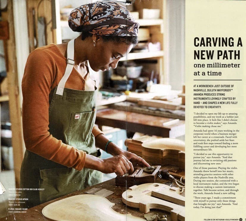
Duluth Trading Company is no stranger to tailoring (literally and figuratively) their assortment to women. The first Duluth Women’s catalog went to market in 2005; the first Duluth Woman model in 2009; and since then, the company—as both their clothing and culture is concerned—has been “designed for capable women.” Lately, though, Duluth has gone next level with their celebration of women with grit and pluck. Enter Duluth’s WayforgersTM (yes, it’s actually trademarked): a program honoring female artisans, makers, engineers and entrepreneurs that forge their own path with courage and resilience. Highlighting these women—their stories, their crafts and their motivations—brings an unexpected depth of storytelling and focused appeal to the catalog we haven’t seen before. The brand’s passion and steadfast respect for hard work easily tie these aspirational stories back to the sturdiness that has always been Duluth. But make no mistake, Duluth continues to look forward; to evolve; and to stay on point with their broader (and female) audience.
2. Distinctly Duluth.
It’s an old method, but it still works. Put your thumb over a company’s logo and ask yourself, “Do I still recognize the brand?” It’s a great test to check if a company’s brand is at home in any piece they produce. And in the case of Duluth, they pass the test. With flying colors. 5 stars. Every time. We can easily point to the recognizable font, the illustration style we’ve come to expect and that certain Duluth-ness (what IS that?) about their catalogs. But there is no question that their cheeky, tell-it-like-it-is copy voice is the most singular and engaging aspect of the brand. Their voice is always present, whether it’s embedded in their humorous product names or visible on a giant billboard. But never more so than in the catalog, which provides the brand’s personality a real opportunity to sit down and get comfortable.
3. Unwavering WIIFM.
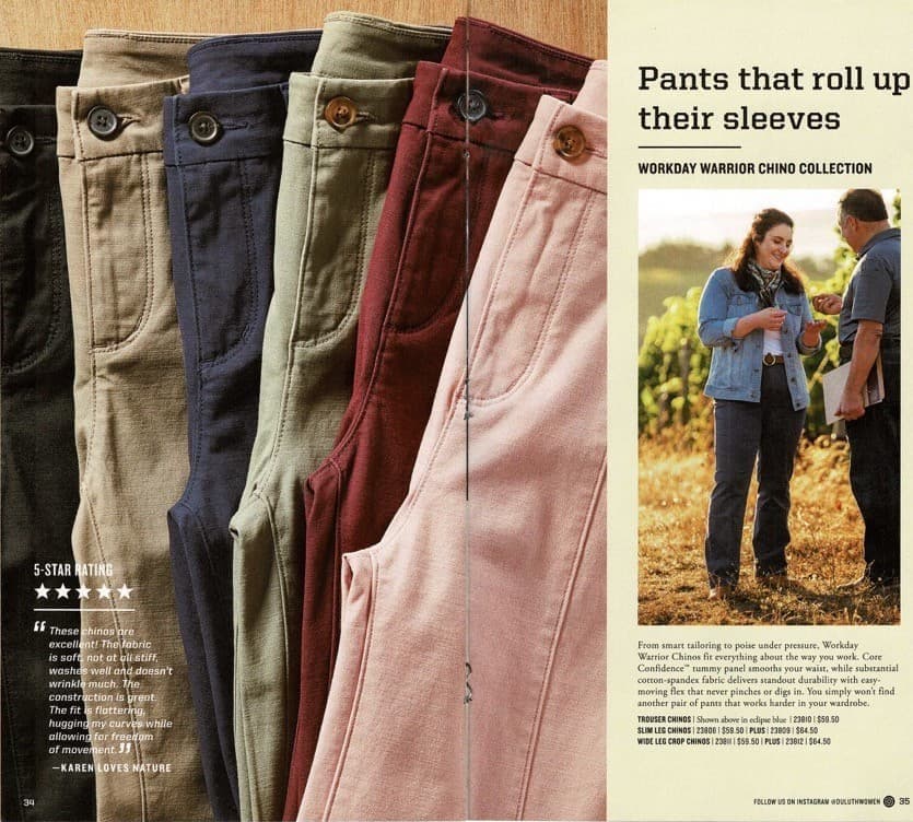
The WIIFM. As marketers we know to lead with the answer to our customer’s questions: “What’s in it for me.” What’s the benefit? The thing about the product that makes it needed, different, new, desired, required. This can be elusive for some brands. But not for Duluth. The Duluth brand—and their product lines—are built on solving problems. Real-people problems. Page by page, product by product, Duluth leads us through the catalog by unabashedly stating the problem and providing the solutions. Over the years they’ve solved Plumber’s Butt and offered a No-Yank Tank, boldly presenting the product benefits at the headline level. Standing by it all with their No Bull (and no shame) Guarantee.
THREE OPPORTUNITIES FOR DULUTH’s CATALOG
- Lighten Up.
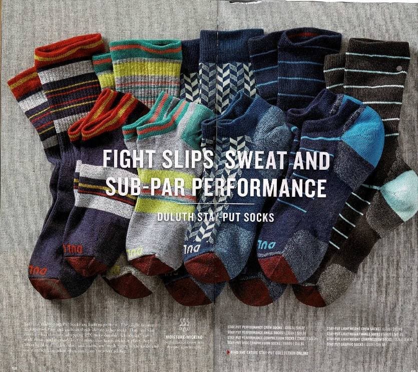
In general, the catalog is visually heavy. The lifestyle images feel dreary, the product shots look dark to the point of losing detail. Product laydowns are shot on backgrounds that don’t complement the colors, but camouflage them. Silhouetted products are designed over shades of color that feel too layered. Color swatches get lost in the backgrounds and in some cases the type is hard to read. The whole design feels over-saturated, and it’s getting in the way of the product.
I get it. These are real clothes for real people. This isn’t cashmere and swank, it’s durability and sweat. The book should reflect the rugged authenticity of the brand. But a little breathing room would go a long way; some white space to hold the product images to let them be the hero. Gritty is on-brand. But dingy isn’t.
2. Provide a clearer map.
In the spirit of the Duluth brand, the catalog is working hard. Selling product, yes. (Remember when that was enough?) But also presenting the chosen Duluth Wayforgers’ stories, and trying to tether them to specific clothing lines. It’s a lot. And for this reader, it was maybe too much. I got distracted (Disrupted and Delighted!) by the editorial. The human interest aspect confused the shopping flow of the book. I struggled to understand whether I should be reading or buying. The courageous stories of women—real Duluth customers—is an inspiring and commendable addition to the catalog. But perhaps some navigation tools or way finders (table of contents? Spread identifiers?) would benefit the shopping journey.
3. Tell me what to do.
Most critical, though, is that the call-to-action seems to have gotten lost in the shuffle. In the case of this Duluth book, the CTA is muted, almost buried. The drivers to the Wayforgers’ businesses are more prominent than the drivers to Duluth. Now, catalogs come in many shapes and sizes, and can run the gamut between hard-working, SKU-laden pages to a lifestyle photobook brand statement. Clearly the intent here is hold up the editorial, human interest stories in the book. But no matter what, we still need to tell our customers what we want them to do, and how to do it. As a customer and a cataloger, I inherently know what to do when I get this in the mail. But if I didn’t know… I’m not sure this book would tell me.
What are your catalog’s strengths and weaknesses? Get in touch with Michele Drohan at micheled@jschmid.com for an assessment.
Read More Catalog Critiques:


Tags: catalog, catalog creative, catalog critiques, catalog design, Duluth Trading Company, marketing strategy, Michele Drohan