Disruptive Catalogs: Part 3

Catalogs aren’t what they used to be – they’re better than ever (or at least the great ones are). Gone are the days of bloated spreads crammed with product after product, trying to fit an entire inventory between the front and back covers. Space has opened up, boundaries are being pushed, and perhaps most importantly – stories are being told.
The changes have been driven by one key factor: consumer expectation. Between overflowing inboxes, targeted algorithms, and a mailbox full of ads that no one quite remembers signing up for a successful catalog today has to disrupt, delight, and drive. Stand out in the mail, tell an interesting story that’s beautifully arranged, and drive consumers to make online purchases. At the core of every campaign and behind every functionally aesthetic layout, is one essential ingredient – copywriting.
From narrative opportunities on the 2-3 spread to eye-catching headlines on the front cover, copy can make us laugh, intrigue our senses, command respect, and best of all create a moment of shared humanity. While some claim that modern audiences don’t read longform copy, it would be more accurate to say that consumers today don’t read long boring copy. They don’t have the time and they expect more. A few emotive words precisely placed have the power to tie together a catalog, shape a brand, and create the very meaning and context the book exists within.
Here are three brands, and their respective catalogs, disrupting with their copy to create an engaging piece of advertising that doesn’t just sell us a product, but that tells us a story about who they are, and about who we can be.
HOKA
As one of the fastest growing running shoe companies in the US, it’s no surprise that the brand would produce a catalog with effective and disruptive copy. The chunky profile of their flagship footwear is as recognizable as their pithy and succinct headlines. As part of the rollout of their Carbon X 2 trainer a reader is greeted with a lifestyle shot of a runner mid foot fall, the headline “Faster Your Fast” emblazoned above his head. It’s purposefully incorrect, it’s attention-grabbing, it’s memorable and directs your attention to the corresponding products.
Headlines aren’t the only place where HOKA stands out though. Across industries and markets one of the key changes to modern catalogs is a willingness to save selling for the third page, keeping the opening spread for brand storytelling. Consumers want to buy more than products, they want to buy exclusivity, inclusivity, ethics, values, and a story they can resonate with and believe in. At the heart of their brand story on the opening spread is a message that resonates with athletes of all kinds:
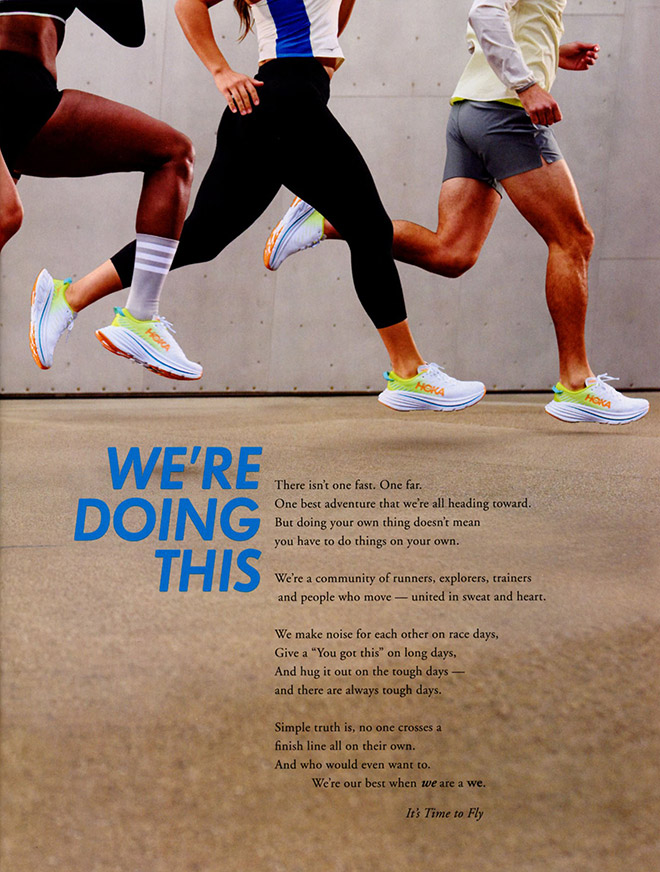
From the headline “We’re Doing This” to the final call to action “We’re our best when we are a we.” Hoka uses their copy to create a shared community between themselves, their products, and their readers. It’s emotionally gripping, it’s inclusive, and best of all it appeals to a huge swath of consumer demographics without losing intensity or focus. Even if you aren’t a runner, you can find a message, and a brand, that speaks to a community built on empathy and support.
Stio
Brands that deal in outdoor apparel and accessories are no stranger to creating disruptive catalogs. From captivating lifestyle images to aspirational travel narratives recounting mountain summits and off-road adventures, there is plenty of room to interrupt expectations. Catalogs from Stio have many of the elements you would anticipate, but also uses copy in surprising ways, to tell a tangible story of sustainability, rather than relying on emotion alone.
As we’ve touched on in past articles, the incorporation of sustainability is essential to a brands success in today’s market. Some approach this through long-form think pieces, others through infographics, while Stio finds a perfect balance with the help of their copywriting.
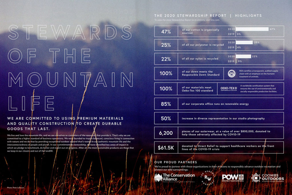
Copy never exists in a vacuum. It lives on the page and should elevate the communication of both content and design. The relationship between the emotional brand story on the left and the concise, easily digestible quantitative information on the right diversifies their rhetorical appeals. It’s attractive, it’s efficient, and it stands out in the book and in the mail. Plus “Stewards Of The Mountain Life” is just great copy.
Best Made Company
There are brands built on the sheer quality of their product, brands built on cost point or ease of access, and then there are brands built purely on lifestyle. They talk how you want to talk, dress how you want to dress, travel, create, and live the life you imagine for yourself. A quintessentially lifestyle-based brand that shines through their copy is Best Made Company.
Now a part of the Duluth Trading Co. family, Best Made started as an independent retailer that gained quick popularity for its utilitarian workwear, rustic outdoor apparel, and of course the signature painted axe. As a brand they built their reputation (and justified their prices) on impeccable lifestyle photography and long form copy that turns every piece they sell into a story of authenticity, exploration, and tradition.
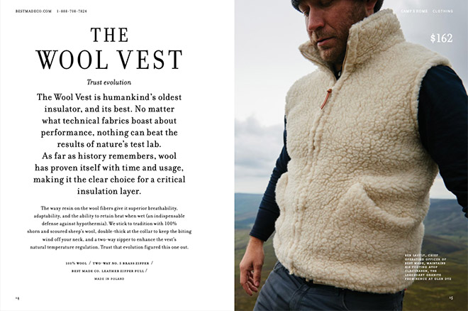
The typeface is sophisticated and attractive. The sub-headline is clever and inviting. The body copy is paradoxically concise and grandiose. The page is well designed, calling to mind black-and-white bulletins distributed on cobbled street corners in a simpler time. All these aspects work together to create a spread that tells a story about the product, about the brand, and about their customers.
I would be remiss to not include a spread that features one of the more iconic, if not unusual products offered by Best Made Company:
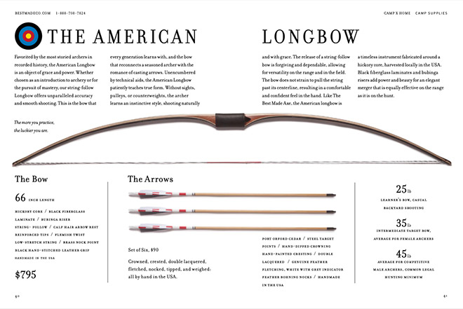
They take the time here to tell a story of “grace and power”. There’s history, product details, and more adjectives than you can shake a stick at – but it somehow works. Is a seasoned archer going to come to this catalog to purchase a bow? Probably not. Does that mean I don’t suddenly want an American Longbow? Absolutely not. Whether or not everything from Best Made Company is in fact ‘best made’ their copywriting surely is.
No matter where it lives inside your book or on your website, good copywriting can be the lynchpin to your brands success. It elevates products, reassures your consumers, and most importantly provides a moment to tell the world a little more about who you are. It’s your chance to not just be creative, but to be human.
If you want to learn more about adding some word-based-panache to your brand or catalog, reach out to Devon at devonc@jschmid.com.
Thanks to Unsplash for the cover image.
Tags: Brand Storytelling, catalog design, Customer Experience, Devon Clements, Strategy