Disruptive Catalogs: Part 5

Invite Interaction
While there’s no denying that print is on the rise, many still think of printed collateral as a static medium. Although there may be some truth to this sentiment when looking at a wide swath of catalogs, it’s by no means an unbreakable rule. Whether to pinpoint a certain demographic, create more opportunities to disrupt in the mail, or to invest in a piece that consumers will want to not only engage with, but that will help to further your brands tangibility and relevance – changing the design of your next book to include moments of direct interaction with customers is a must.
The best, and perhaps most daunting, part of creating interactive catalogs and mailers is that the sky really is the limit. Some examples you’ll see are as easy as changing a design layout, others involve new exciting formats, and still more come from thinking completely outside the box and reimagining what a piece of printed advertising can be and do. No idea is too big or too small, so let’s start exploring!
Games and Activities
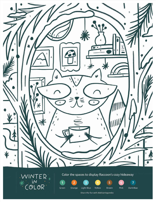
One of the easiest (and cheapest) ways to incorporate interactivity through your catalogs is by adding extra spreads dedicated to games. This tactic is especially effective if part of your brands focus is aimed at selling children’s products. For the past few years Amazon has gotten attention for mailing out a printed toy catalog for the holiday season. It made waves not only for being a famously e-commerce orientated company pivoting to print for the first time, but also for the child-focused approach to its design and structure. Throughout the entire book readers will find spreads like this:

Mazes, coloring sheets, short stories, even a spot to write out their very own holiday wish list. You can find all of these and more in the Amazon holiday book. From headlines that invite childhood discovery, “Cheer Starts Here”, to playfully illustrated animals, this book manages to not only stand out in the mailbox, but stick around to be colored on, read, and most importantly have its many products reverently circled by little ones dreaming of Christmas morning. Amazon designed a catalog not for the names on their mailing list, but for the children in each and every one of those households. It’s simple, it’s effective, and it creates a direct link between the brand and the emotional appeal of holiday gift-giving.
Incorporating Technology
When QR codes were first introduced in the American market consumers were largely…unimpressed. You had to download a 3rd party app to scan them, the use cases weren’t fully fleshed out, and huge swaths of the population didn’t take to it. After another 10+ years and a global pandemic that pushed forward all things digital, QR codes are as ubiquitous as any other marketing medium. Almost all smartphone cameras have integrated technology to recognize and handle them – and consumers now know how helpful they are in transitioning from print to digital seamlessly, quickly subscribing to email lists in order to receive welcome offers, accessing video content, and navigating to personalized URLs that will give helpful demographic feedback to brands.
For companies looking to push a technological advantage through their printed material, one option is to incorporate QR codes that link to an even more modern visual medium: augmented reality. Whether accessed through a QR code, an application, or a web browser, AR is a great way to add an extra dimension to your products by creating interactive content that blends with the real world.
While there are many great examples of this trend across home furnishings, clothing, and even construction, for this case study I would like to focus on IKEA. While they sadly decided to end their print and digital catalog in 2021, they led the industry in their use of AR immersion. Here’s a video from IKEA USA demonstrating AR functionality in use with their catalog:
It starts with a simple “Scan page to see more” call out, then the quick download of a free app, and customers have the ability to test out furniture in their home without making a trip to their nearest brick-and-mortar store. Enlarge that dining room set to its exact dimensions, see how it fits, view different colorways, all from your smart device. While similar approaches can now be seen in the marketing materials of other big names in the home furnishing industry (Wayfair, Crate and Barrel, etc.) IKEA was unique for incorporating this technology in their digital and their print books. It might still be a little clunky and it may have a high cost of entry, but I’d wager as the years go by AR might follow in the path of QR codes, making a big impact on how and why we buy.
Rethinking Formats
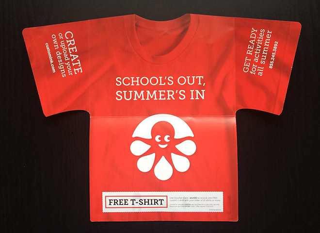
When paper supplies for full-length catalogs are running short, or if you want to add a little variety to your yearly mailings, a format change might be just what you need to bring a new level of engagement to your marketing. You might consider custom Die-Cut shapes for postcards, creating a unique look and feel to your brand messaging:

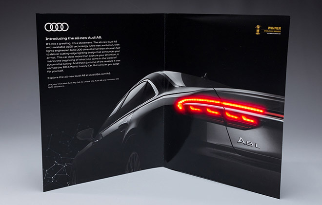
You could even change the dimensions of your book to large or distinctive sizes that will stand out in the mail. If you wanted to take it a step farther, especially for a targeted demographic of high-value consumers, you could re-think the format entirely to disrupt in the market, delight with the piece, and drive them to act. In 2018 Audi worked with PHD Media and Venables Bell + Partners to create a print-magazine insert that does just that:

This astonishing piece was hand-tipped and secured with glue dots to the November/December issue of Meredith’s Departure magazine. Wonderfully atmospheric photography combined with Invercote Creato paper and several small OLED lights worked together to create a stunning ad that mirrored the new taillight design of the vehicle itself. Every time the insert is opened the lights animate, creating a truly one-of-a-kind piece. It truly pushed the limits of what a magazine advertisement could look like and is capable of.
It’s worth noting that Departures was published exclusively for American Express Platinum Card Members, and that the Audi A8 started at an MSRP of $93,000. Needless to say, this costly venture was only possible given the audience demographic and product in question.
From simple design changes that promote direct consumer engagement, to complete overhauls of structure and format, there are many ways to promote interactivity across your books and printed ads. The key is creating a piece that disrupts in the mail, delights consumers with engageable content, and then drives them to make a purchase.
If you want to learn more about adding some interaction to your brand or catalog, reach out to Devon at devonc@jschmid.com.
Thanks to Unsplash for the cover image.
Tags: Brand Storytelling, catalog design, Customer Experience, Devon Clements, Strategy
