
Disrupt. Delight. Drive. Three words that, together, form a mandate for our catalogs. From crowded mailboxes our books need to stand out and garner attention; pay off that attention with content that creates desire, and – ultimately – compel our customers to click, call or visit. It’s a tall order. And that first piece, Disrupt, is the 1st priority. If it doesn’t happen, the other two won’t. We could mail an 11” x 17” oversized book. That will get noticed. So would a ‘scratch and sniff’ cover? But most of us don’t have budget to add a bunch of bells and whistles just to make us louder than the other guys.
I’m particularly mindful of this as I wade through the current flood of women’s clothing catalogs in my own mailbox, most of them conveying the long-suffering mashup: covers graced with women pouring each other glasses of Rosé, or bikes with flower-filled baskets. Make no mistake: this is not a judgement, but a shared burden. What can we do—any of us—to stand out in a sea of perpetual sameness, when all we have to work with is the traditional, two-dimensional real estate of a catalog cover?
Your brand should be front and center; your product selection and your offer need to be strong: these are all part of the best practices mix. But there are also some creative ways to make them come together on a cover that really stands out from the ubiquitous and expected. Here are five fundamental ideas you can build on with your next catalog cover.
Adding stuff doesn’t make a good idea better, or a catalog cover great.
Express yourself.
Don’t underestimate the power emotion has in reaching your customer. Sometimes all you need is a face; eyes; to connect and express the core of your brand. Is it happy? Content? Laughing? Satisfied? Relieved? Express yourself through lifestyle photography that brings emotion up close and personal; put a face on your brand. Consider this: heat-mapping studies show a reader’s eye is always attracted to the eyes in an image first—especially if they are looking at the camera.
Play with product.
Think of new ways to show your product on the cover. Use the catalog cover design to provoke interest rather than sell the product. Whether it’s an unexpected angle, a dramatic crop or a clever way to show a group of products, a unique image can both be on brand with your product, and create interest in the mailbox. Garnet Hill had a beautiful cover in the spring mix. Rather than showing a finished product, it featured a hero shot of… color swatches. It was on brand and screamed spring, but in a fresh way by showing the colorways and crisp fabrics on offer.

Add flair to your photography.
If you’ve got the opportunity to shoot new covers, the photography itself can bring drama or something special to your book. Get your ‘safe’ shots, then get playful with photography. Think about interesting crops, unique perspective/angles, unusual lighting or product/people in motion. Consider getting some handheld shots. This is a great way to spend your photography investment—let the art of it take your cover to the next level.
Less is more.*
When in doubt, keep it simple. Really simple. Less is more—the notion that simplicity and clarity lead to good design—is proven over and over again. Simplicity can find itself in minimal copy or clean imagery, even in the absence of things. Simplicity can be the overall concept. Adding stuff doesn’t make a good idea better, or a catalog cover great.
*The phrase “Less is more” is a 19th century proverbial phrase, first found in print in Andrea del Sarto, 1855, a poem by Robert Browning. So, now you know that.
Try text-only.
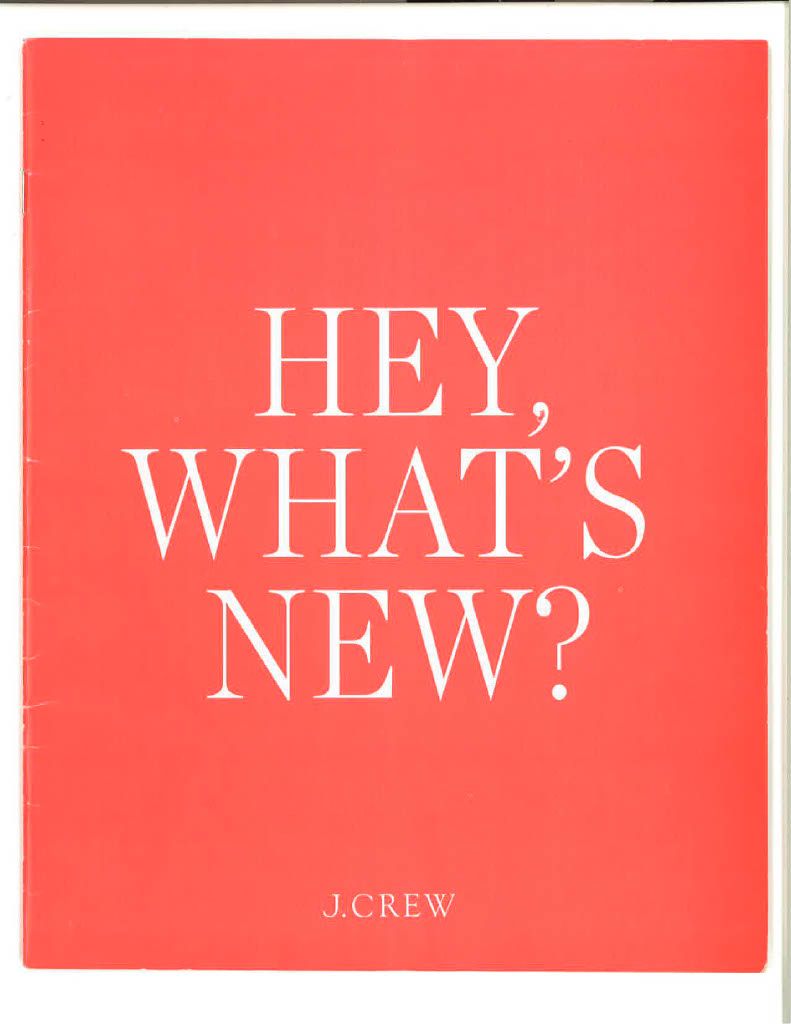




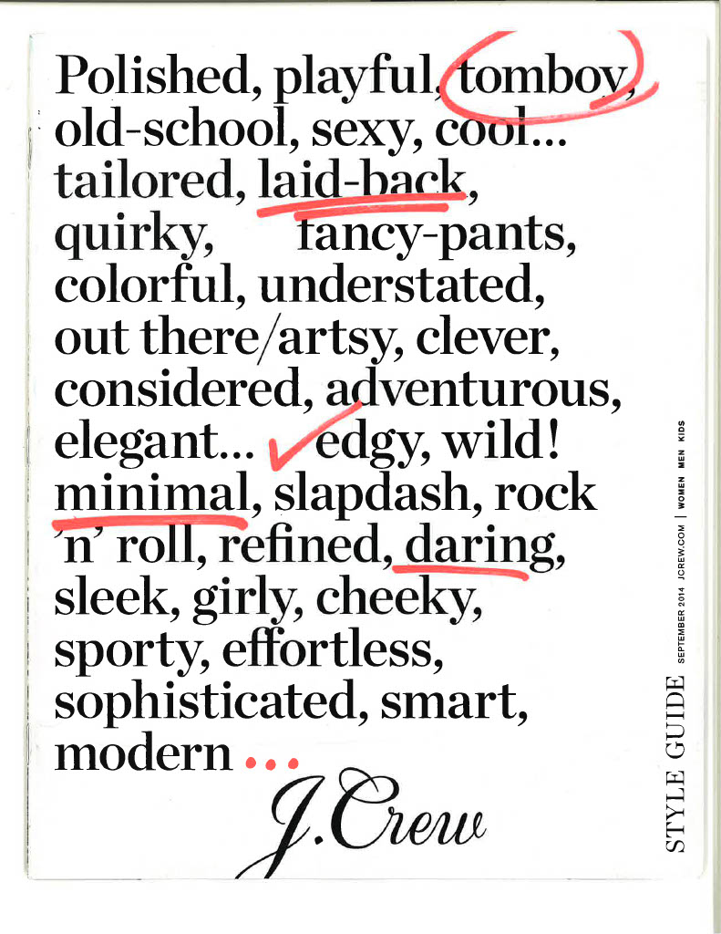
Speaking of simple: a text-only cover can be powerful if you have a big sale or announcement… or if your brand voice is truly recognizable. Nothing breaks through the clutter like a solid bleed of color with a big, bold headline. Nothing else Except your logo, of course. Or take a page out of Bloomingdale’s book, and consider your logo as your single, statement cover. This can be graphically interesting and unusual if you play with the logo as a design element. And sometimes, it’s all you need to say.
There are two important caveats here (because life is complicated). First, no matter the direction you take your catalog cover design, make sure your brand is at home. Unique and unforgettable is only awesome if your customer can still recognize you. And finally, if you’re going way out there in a new way, consider pre-testing the cover with your customers. Or test in it in the mail. Because unique and unforgettable is only awesome if it sells.
Want your catalog cover design to stand out from the sea of sameness? Email Michele at micheled@jschmid.com
Tags: catalog cover, Catalog Cover Design, catalog design, catalog photography, Michele Drohan, Photography
