Who said “yes” to what? I’ll get to that in a minute.
First, let me share a story. Decades ago, we heard the following from almost every food retailer we worked with:
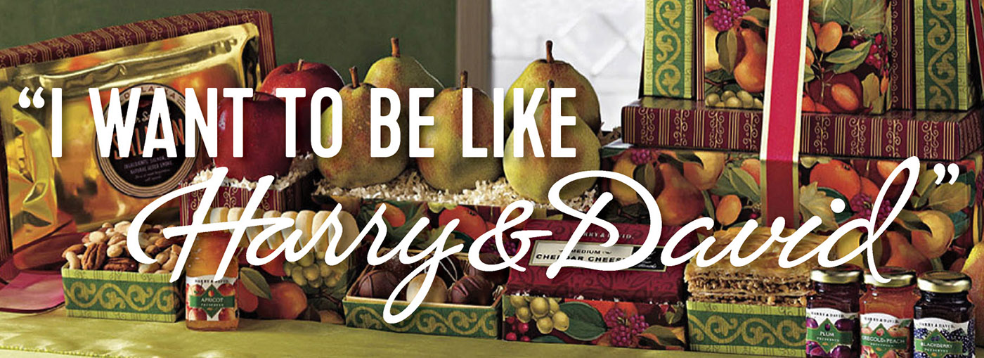
“We want our catalog to look like Harry & David’s.”
Why Harry & David? Because at one time, they set the standard for innovation in catalog creative. As an agency, we studied their craft and admired their dedication to creating incredible covers and then telling an amazing story within the pages of their catalog. Then I had the pleasure of meeting Neal Schuler, the Vice President of Creative Services at Harry & David, when we were both on a creative panel at an industry event. I took the opportunity to learn as much as I could from Neal, and as much as I could about their successful formula. Here are five things I learned:
- The Art of Merchandising. For Harry & David, it wasn’t enough to sell incredible-tasting pears. Instead, it was about the art of the gift. They pretty much invented the “gift tower,” but then took it to the next level. They explored different ways to sell towers, using paper wraps with different themes that would appeal to a variety of audiences. They were simply beautiful.
Takeaway: Don’t stop with your core product. Take it one step further and ask, “what else can we do to enhance the customer experience?”
- The Art of Pricing. Yes, the towers were decorative and beautiful, but they were also offered at a variety of price points. Every tower design included an average price point that would appeal to most gift-givers, along with a lower- and a higher-priced option so that every gift list need was met.
Takeaway: Understanding your customers’ needs and pricing thresholds is critical. Consider your best sellers and use customer data analysis to develop good, better and best options.
- The Art of Analytics. While their catalog spreads were gorgeous, you wouldn’t know that the design was guided by product analysis. They understood which products, which tower designs and which prices appealed most to their customers. So, the products with the highest price points were seldom the heroes of the spreads. Instead, they placed average-price-point items in the hero positions (upper right-hand corner), ensuring customers would first see what would appeal to them MOST while still offering them multiple options.
Takeaway: Using analytics to design spreads is NOT a dead art. Designing to customers’ needs will resonate and increase response and your average order.
- The Art of Storytelling. Every spread told a story. It might have been a seasonal theme, brand story, tower story, product story or a gifting story. Harry & David never just placed items on a page without thinking through the story that would resonate with their customers.
Takeaway: Plan out every spread! What is the story you are telling and how can you guide the reader in a compelling way that ultimately engages them?
- The Art of Great Design. Neal’s team understood the value of building a spread that was easy to shop while still appearing beautiful. The photography formula demonstrated consistency in the angle, field of focus, background, propping and overall crispness. Every detail was considered. This same formula carried through to their simple, consistent, uncrowded and clean design. Every design element had a reason for being and it was pleasing to the eye. And, their covers were simply breathtaking … innovative, creative and attention-getting!
Takeaway: Design hygiene matters! If you want readers to spend time with your spread, edit extraneous information and build spreads that are clean and uncluttered. Cramming in every detail does NOT encourage readership. If you have more to say, send them online.
The result of what Harry & David created was a “look” that was uniquely THEM. One would always know it was a Harry & David catalog, even without seeing the logo. Every brand aspires to own their own look but honestly, few seldom do. Amazingly, these five observations still resonate today, even with our ever-changing marketplace. Applying these takeaways to your catalog process will most certainly make your brand the envy of your category, and more importantly, I can guarantee an increased response.
Since then, we’ve been following Neal’s career – watching him apply his genius to brands like Colony Brands and Yankee Candle. Thankfully, we’ve stayed in touch, and we’re excited to share that Neal said “yes” to joining our talented J.Schmid team as VP/Creative Director. Why are we so excited? Because, just like our current team, Neal understands the art of distance selling (which few creatives do).
 Here’s what Neal has to say about catalogs:
“A good catalog tells a story. It has the creative ‘elbow room’ to inspire us to try something new, revisit a favorite, inform and educate. Pages can be paced to take the reader on a journey that drives affinity for brand, assortment and establishes relevancy. It promises (even in small ways) to improve our lives! And, the catalog is the best promoter for a website or a trip to a store. The hardest working piece of marketing in the ad business!” –Neal Schuler
We cannot wait to apply Neal’s talents to our clients’ catalogs. Are you interested in what he has to say about your catalogs? Or, would you like to congratulate him? Send him an email at Neals@jschmid.com – he’d love to hear from you!
Tags: catalog design, harry & david, Lois Brayfield, neal schuler, Strategy

