Disruptive Catalogs: Part 1

Catalogs have changed. For the better. They’re no longer intended to be your entire store in the mail. They’re not just a transactional tool anymore. They’re more than that. Consumers expect them to be more than that. Today, catalogs should do three things: disrupt, delight and drive people to action.
This new blog series we’re calling “Disruptive Catalogs” focuses on the first of these three points. We’ll feature a series of articles that explain how your catalog can be disruptive in the mail, and in the hands of your customers. I’ll begin the conversation with some thoughts on how to properly and effectively showcase your brand on the pages of your catalog. Because as we know, everything starts and ends there—with your unique story. The thing that makes you special.
When I first started designing catalogs a couple decades ago, finding any reference to a brand story on the pages of a catalog was few and far between. The real estate on those pages was deemed too valuable to be wasted on “non-selling” content. Only “special” brands like Patagonia and Crate & Barrel could get away with doing such things. I always thought that was hogwash. How could customers or prospects be expected to make a purchase before they even knew anything about you or what your story was? Shouldn’t you at least politely introduce yourself first? It always felt disingenuous to me. Still does.
But over the years, more and more brands have not only realized the importance of telling their story and communicating how special and different they are, but they’ve embraced it. Catalogs have evolved into a multi-layered, multi-functional tool that can do many things beyond just screaming “Hey, buy this!” And in the process of pushing their brands to the forefront, they’re also disrupting in ways that stand out and make an impact.
Here are three things to consider when trying to integrate your brand story into your catalog and ultimately being disruptive in the mail. I call them the Three V’s.
Visual cues
Many people assume that telling your brand story in a catalog is only done through the written word. Not true. What you SHOW can be just as powerful as what you SAY. The right images can convey attitude, expertise, personality, place and quality. All important components of how a brand is perceived.
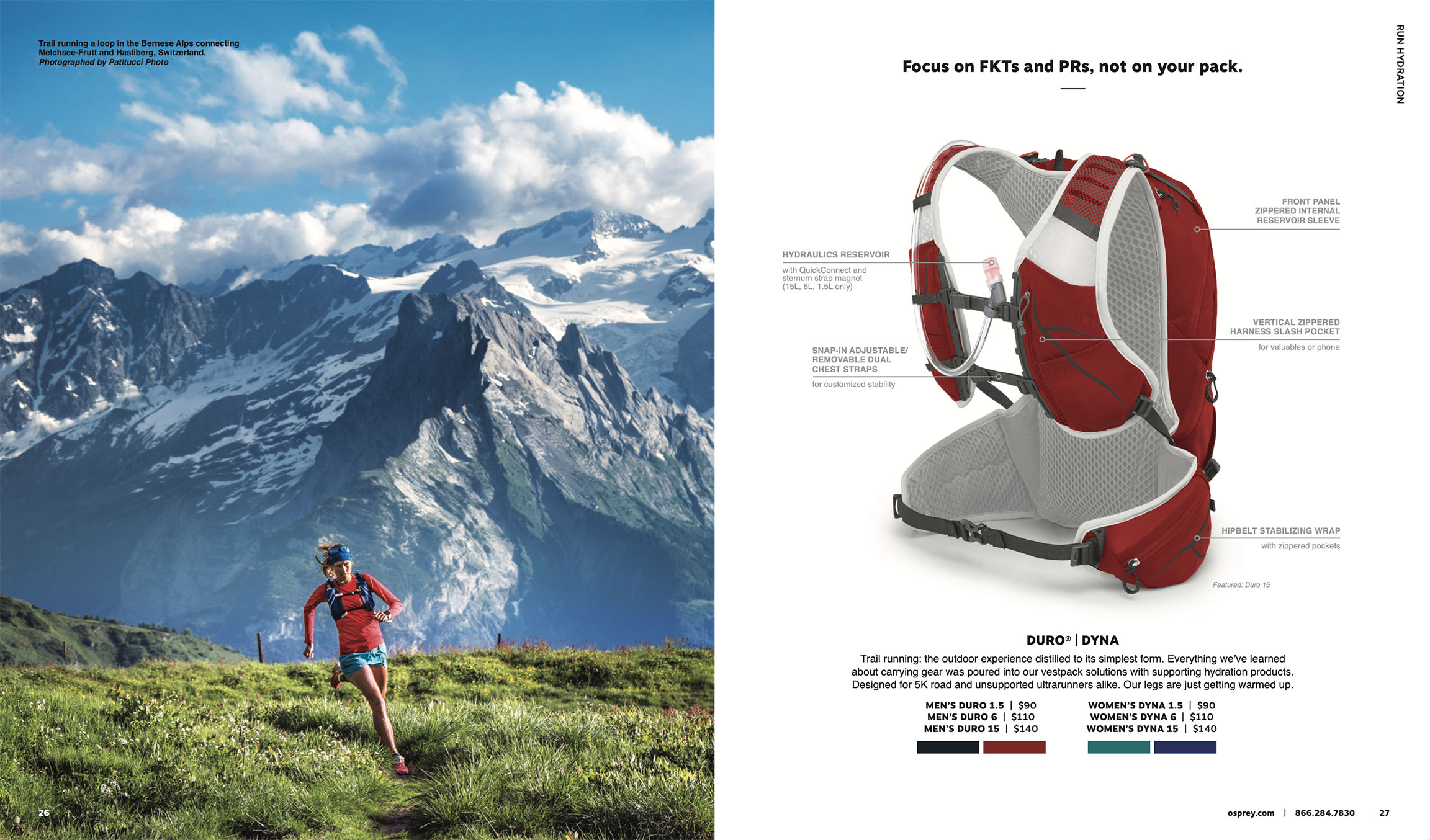
Let’s take a look at an example of what I’m talking about—the Osprey catalog. Their products (backpacks) are best-in-class. However, they quickly justify the cost by backing it with a story of premium quality and design. But most importantly, they SHOW you what you can do with their backpacks—get outdoors. Have an adventure. Go places. You don’t need to read any copy to immediately understand the benefit of a quality backpack. They use aspirational images to put you in the environment you desire. These show-stopping images are impossible to ignore and guaranteed to get attention. They draw you in. And to make them even more disruptive, Osprey devotes the proper space to get the images as large as possible. Are these photoshoots expensive? Yes. Are they worth it? Absolutely.

Voice
Great brands are just like people. They have a personality, a certain language and way of speaking that is recognizable—a voice. People often ask me if anyone reads copy anymore. My answer is, they do if it’s good. Great copy can be one of the best ways for a catalog to be disruptive. You can add a certain edge with spicy language. You can be funny, intense, dramatic, endearing, bold, irreverent, inspiring or buttoned-up. Just don’t be boring.
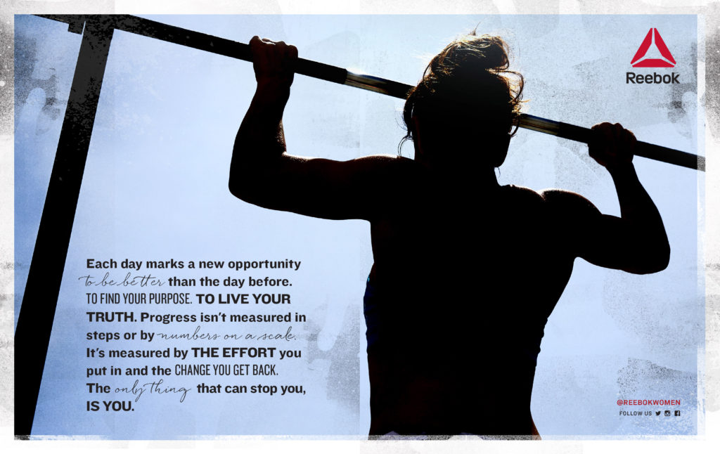
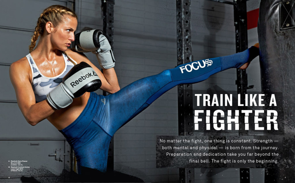
Reebok is a great example of a brand that clearly communicates a unique personality through their copy. It’s bold and inspiring. They motivate their customers with uplifting messages and positive reinforcement. And when those words and messages are presented in a graphically interesting way (in the hands of a good designer), they become disruptive and are hard to ignore. It brings the brand to life. And it makes the experience of interacting with that brand feel exciting and worthwhile.
Read your copy out loud. Does it sound uniquely you? Does it have energy and life? Does it give you goosebumps and make you smile? Is it disruptive, or is it disappointing?
Verisimilitude
Verisimilitude is a fancy word for believability and credibility (I needed another “V” word). For brands that are making any kind of a claim, in addition to just selling stuff, believability is vital. Are you claiming to have the best quality products in your category? You better prove it somehow. Are you the knowledgeable experts in your industry? You better have content that backs it up. For brands that are trying to stand apart from their competitors, disruptive content that supports your unique positioning can be key to convincing folks why they should consider you above all the other choices they have.
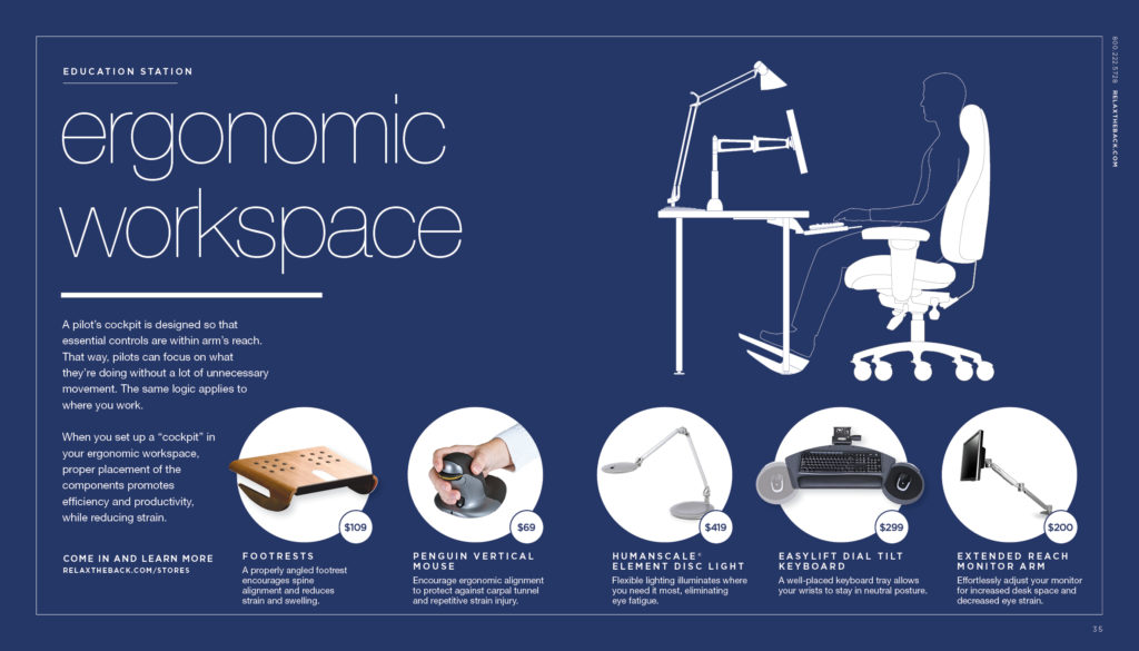
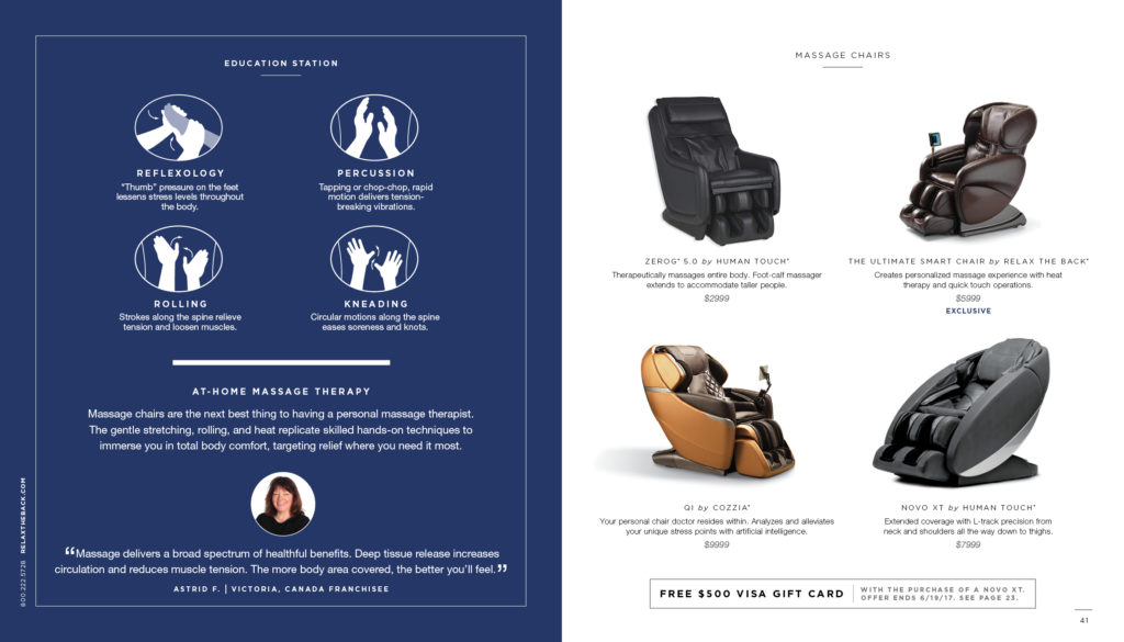
Relax The Back, the nationwide retailer that provides complete wellness solutions for every aspect of your life, does a great job in their catalog of providing content that supports their positioning as “experts” in total body wellness. It would not be nearly as believable if they were selling $8,000 massage chairs but didn’t drop some knowledge on you about the benefits of massage and tips on how to use at-home therapy. Because they sprinkle disruptive content throughout their books in the form of blue pages titled “Information Station”, they create verisimilitude throughout—making you believe they are indeed experts and can be trusted.
What are you doing to support and prove your brand positioning in your catalog? Is it presented in a disruptive way that stands out and is easy to find? If you’re not talking about it, why should anyone believe you?
I hope these tips are helpful as you consider ways that your catalog can be a disruptive force in the mailbox. Keep an eye out for the remaining posts in this series on “Disruptive Catalogs.” And if you could use a little help making it happen, give me shout at brentn@jschmid.com. It’s what we’re built to do.
Thanks to Unsplash for the photo by Noah Buscher
Tags: Brand Storytelling, Brent Niemuth, catalog design, Strategy
