Disruptive Catalogs: Part 4

Dilly dilly.
I’m lovin’ it.
Get a Mac.
Why is it so easy to rattle off the brands that introduced us to these catchphrases? Because Bud Light, McDonald’s and Apple are among the best at telling stories, catching us off guard and even making us laugh. They understand the power of a campaign and how disruptive a “big idea” can be. And how powerful it can be—helping us consider their products for the first time, or again in a whole new way.
But for a campaign to reach—and disrupt—the most people, it must be executed across all touchpoints (in digital and in print). Which means your latest campaign absolutely belongs in your catalog. And not just on the opening spread. A catalog gives your brand multiple opportunities to separate itself with a big idea, and I’ll take you through three examples to prove it.
SPANX: Made of More
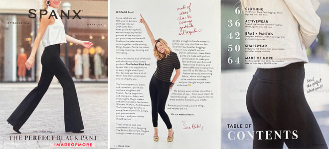
Lots of brands sell black leggings. But Spanx cut through the clutter with their #MadeOfMore campaign, which helped launch “The Perfect Black Pant” in their September 2019 catalog. The campaign (which still has its own landing page on the Spanx website) was introduced on the front cover and explained on the opening spread with a letter from Spanx founder, Sara Blakeley. She proposes that just as women have many traits and quirks that make them who they are, so do Spanx products: “You’re not just one thing, and neither are we. We are made of more.” The upbeat, relatable copy wraps around a candid photo of Sara pointing up toward the first sentence of her letter, helping with eye flow and increasing the chances that we read what she has to say.
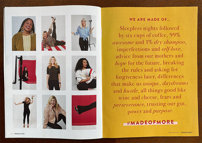
On the next spread (pages 4-5) we get a glimpse of the women featured in the campaign, with a #MadeOfMore manifesto on the opposite page. The copy is punchy and honest, and does exactly what a campaign manifesto is supposed to do: it spurs action and emotion, while articulating what the brand stands for and where it’s going at that moment in time. It’s punctuated with the campaign hashtag, which serves as an invitation for us to engage with the brand beyond the pages of the catalog.
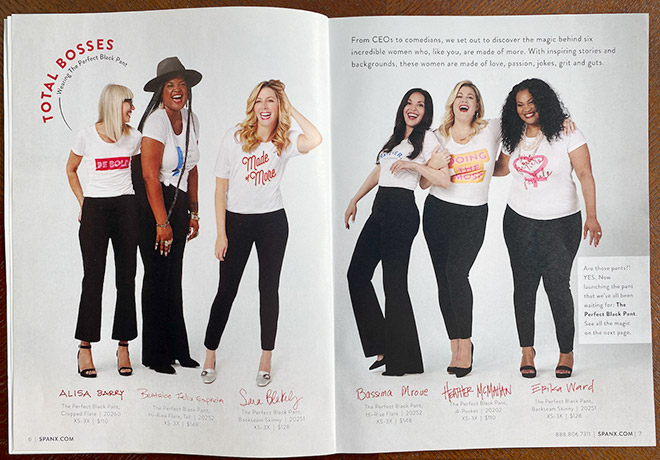
What’s most impressive about this campaign execution is how much real estate is devoted to it on the first few catalog spreads. Spanx works hard to connect with us on a human level before trying to sell us anything. Pages 6-7 (below) are the first time we see product SKUs and prices, and even then, they’re secondary to storytelling and the women being featured.
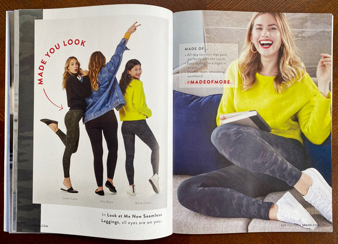
After these first three spreads, there’s a section intro for “The Perfect Black Pant” and subsequent selling spreads for other Spanx products. Notice that the hashtag still has a place on the selling spreads to help carry the campaign throughout, but it’s applied in a different way to speak to product features and benefits.
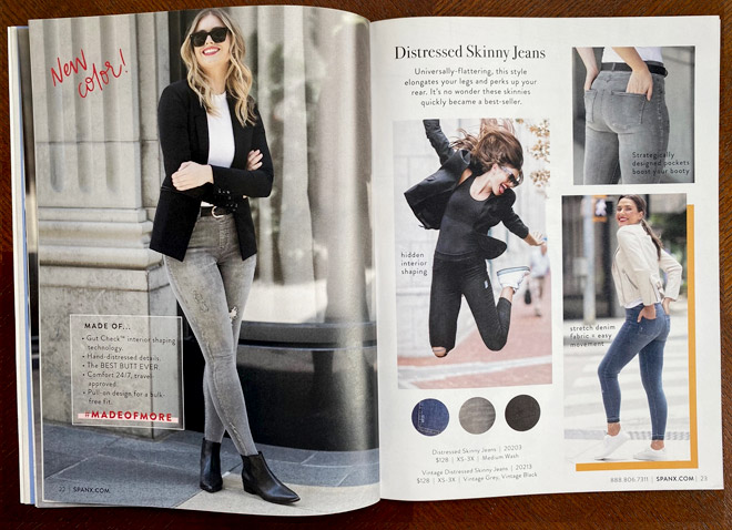
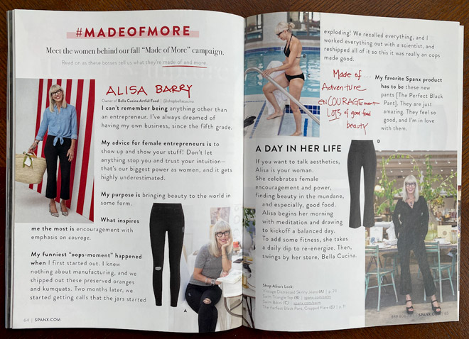
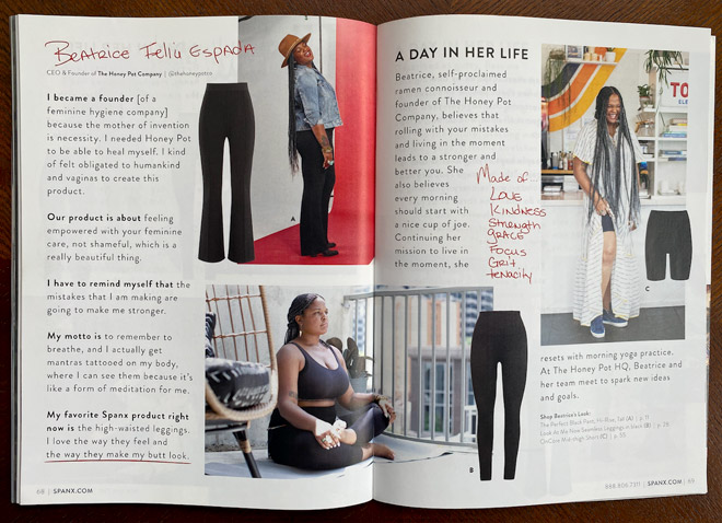
Similar to how it started, the Spanx catalog wraps up with six spreads dedicated to the #MadeOfMore campaign, one for each of the women featured (two of the six are shown below). This is a great example of how catalogs have changed in recent years. A catalog gives your brand space for longer-form storytelling—a chance to connect on a human level and engage consumers before trying to sell us anything. Engaging is what leads to selling.
Opportunity:
The campaign hashtag is prominent throughout the catalog, which is great, but Spanx never tells us WHAT to do with it. While seeing a hashtag tends to make us think of social media, it would be more direct and engaging to add some lead-in copy and create calls to action (i.e. Tag your new favorite Spanx outfit with #MadeOfMore … Love The Perfect Black Pant? Show us on social with #MadeOfMore). Not every instance would need it, but adding copy before the hashtag in a few spots—at the end of the intro letter, in footers throughout, and in the back where the campaign is fully paid off—could significantly increase engagement.
BACKCOUNTRY: reThink Winter
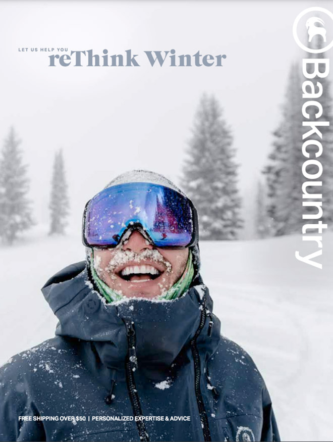
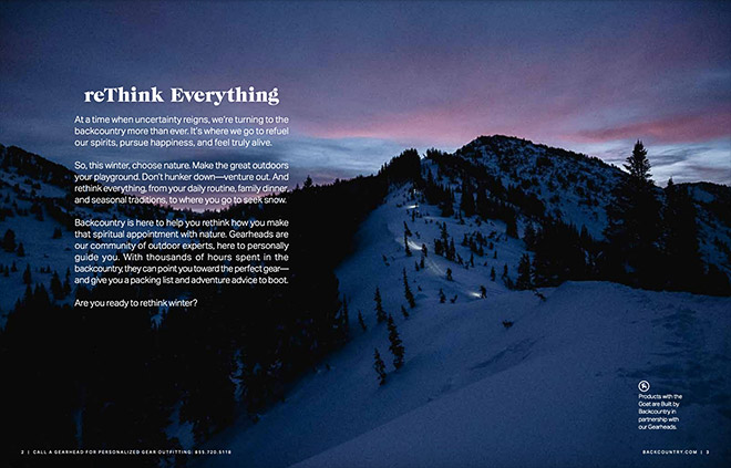
Backcountry has a lot of competition in the outdoor gear space—all the more reason to disrupt consumers with a campaign. In winter 2020 (when COVID was at an all-time high), the Backcountry catalog (PDF) invited us to “reThink Winter” and safely venture outside rather than hunker down indoors.
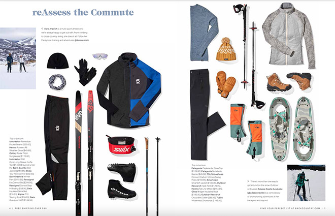
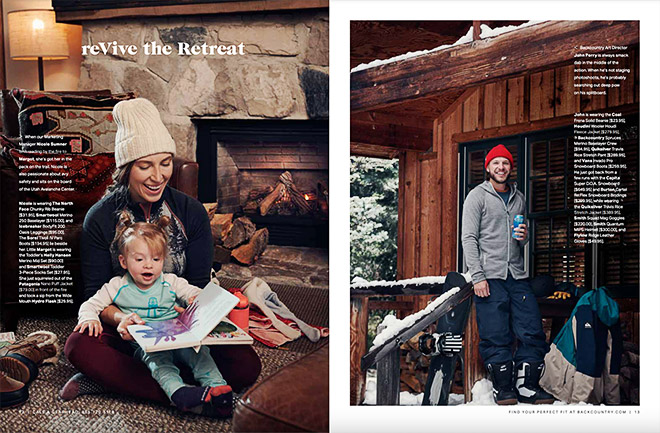
Like the Spanx example, Backcountry featured real people, from athletes and influencers to their own employees, to bring the campaign to life. The “reThink Winter” idea was first introduced on the front cover and manifested on the catalog’s opening spread. But instead of repeating “reThink Winter” throughout, Backcountry used the idea to inspire some really stellar, active headlines. Each was followed by a mini story about the person or people featured on the page, all of whom appeared to be making the most of the season with the help of Backcountry products.
Opportunity:
While I love this brand and think their campaign idea was really strong (and relevant during COVID), I would’ve liked to see calls to action for engaging with the campaign beyond the catalog. Yes, some of the copy invited us to follow the personal accounts of the people in the photos, but we were never asked to share our own Backcountry experiences on social. Turning the name of the campaign into a hashtag and applying it in a few places, like page 2 (i.e. Are you ready to #reThinkWinter?) or even asking us to use their primary brand hashtag (i.e. Are you ready to rethink winter? Show us with #FindYourBackcountry) could have given this campaign a lot more momentum.
SUMMERSALT: Every Body is a Summersalt Body
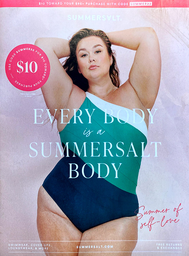
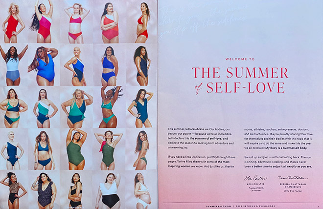
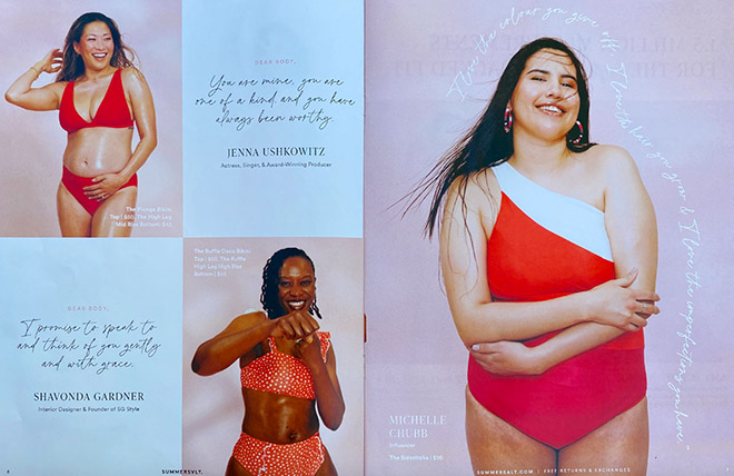
Ah, Summersalt. You’ve heard us gush over their catalog before, but now we’ll look at it through the campaign lens. Like our first two examples, Summersalt has all kinds of competitors in their category. But they stand out because they’ve made body positivity such a big part of their swimwear brand.
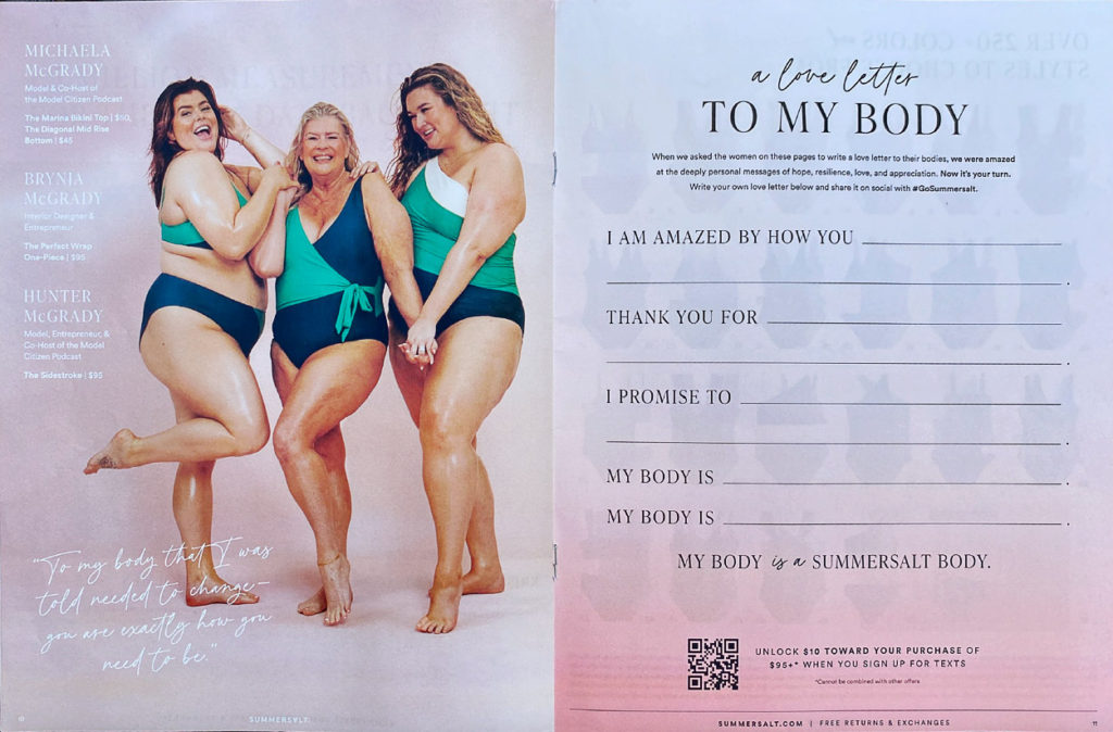
Their latest campaign—Every Body is a Summersalt Body—is front and center on the cover of their summer catalog, and a prominent part of each inside spread. Summersalt also features real people to tell their campaign story (not a requirement by the way, but it does help make a campaign more relatable). At 20 pages, this catalog is much shorter than the Spanx and Backcountry examples (76 and 36 pages, respectively) yet Summersalt still devotes significant space to storytelling. They even have a full page titled “A Love Letter to My Body” where we’re invited to grab a pen, fill in the blanks and then share our letters on social with the brand hashtag #GoSummersalt.
And that’s where Summersalt sets itself apart from the first two examples. They tell us exactly what to do and how to engage with their campaign—with a positive, uplifting exercise to boot.
Opportunity:
The “love letter” page is the only place where we’re asked to engage with the campaign on social, so I would’ve loved to see a couple more of those calls to action. Easy spots to add it would be in the intro letter on the opening spread, and in the footers throughout the catalog.
So, there you have it: Three catalogs. Three campaigns. Lots of good things going for them, and a few opportunities to make their ideas even more disruptive.
What’s your next big idea? If you need help coming up with one (or bringing it to life in print), send me an email at kelseyf@jschmid.com
Tags: Brand Storytelling, catalog design, Customer Experience, Kelsey Finley, Strategy
