Part 5: The Art of the CTA

Ah, the ubiquitous—and critical—Call to Action. Great branding, sumptuous, emotional or humorous creative, a strong voice: they are the vessels that hold the CTA. The ask: to buy now; sign-up; get more information; go online; hurry, don’t miss this sale. For every response-driven tactic we create—from catalogs to emails—we need to ask ourselves, “What do we want the customer to do?” Indeed, high-level, impactive brand campaigns can be relieved of the CTA burden when awareness itself is the end goal. But for most of our day-to-day work, the collective “we” need to consider what behavior we are trying to provoke. Once that preferred action is defined, the CTA has the football.
So many right and wrong ways to create a strong Call to Action. And so many opportunities to be creative while still getting the job done! Here are just a few thoughts in case you’re in a rut.
RISK RELIEF
In almost any instance, it’s a good idea to consider lowering the barrier to action
In almost any instance, it’s a good idea to consider lowering the barrier to action. In the simplest of terms, notice how most companies use an “Add to Cart” button rather than “Buy.” It’s a nuance, but an important one. The customer knows it’s not the money-spending, go/no-go moment. (It also has a lot of other benefits, as well. But not today’s topic.) “Get a Quote,” “Start Your Free 30-Day Trial” and “Compare Products” are other ways to ease the customer in. Of course, you don’t want to put them through too many steps if they know what they want and are there to buy. But particularly for large purchases or commitments, hold their virtual hand and let them know that one click will not lead them down a dark staircase.
CREATE SOME URGENCY
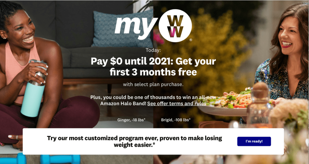
Timed offers are not only easy, but obvious. So are impending seasons or holidays: they have a built-in deadline to them. But even without an end date to your offer, you can still generate a little adrenaline. Tap into emotional motivators such as envy, fear, greed or pride (sound familiar?) and others, and why your offering is an immediate solution to it. As a marketer, don’t be shy to recognize these natural and common human weaknesses as moments in which our consumers respond. Weight Watchers does this well on their website. Both subtle and quietly inspiring, their calls to action are gentle nudges and come across as opportunities throughout their landing page for you to make the decision for yourself. Plenty of risk relief, and leaving it in your hands to say “I’m ready.” That’s creating urgency in a very nuanced and personal way.

GET THEM TO ENGAGE
Remember that your CTA is not a single button or directive. It’s a network of invitations to your customer. This is a channel-agnostic principle. No matter where your customer is, they need to understand what you want them to do, why they should do it, and how on every web page, and on every catalog page. So beyond your traditional Call to Action, find other ways and opportunities to drive your customer to engagement. For instance, use print to point them to all the resources and tools you have online to learn, compare and decide. The running 800# and URL at the bottom of every catalog page is standard, yes, but it’s not enough. Use the real estate on the page to invite the customer in—and therefore to engage with your brand and products—in myriad ways beyond the traditional ‘call/click’ to buy.’ Online tools and resources, social media, blogs. Whatever you got. Give them a choice of paths to take.
BE YOUR (BRAND’S) SELF
Your Call To Action doesn’t have to be boring. Your CTA is a great way to carry your brand forward in unexpected ways.
Your Call To Action doesn’t have to be boring. Your CTA is a great way to carry your brand forward in unexpected ways. Where it’s place (be strategic here), what it looks like (make sure it stands out) and the language you use can go a long way to add to your brand presence and get your customers to act.
Whether your brand is lighthearted, bold, trusting, serious or nonconformist—you name it—please remember who you’re talking to: humans. Not demographics or segments or personas. Actual humans that are living lives and have personalities and families. Treat them as such. Concern, humor and other demonstrations that tell your customer “we get it” goes a long way.
A GREAT EXAMPLE
Duluth Trading Company is always a standout. As a brand, they are unfiltered, candid and humorous. I love this brand and everything they do. And their unique voice comes through even in their CTA. They don’t bother with platitudes or pleasantries. They get high marks all around: they remind you what the problem is (and make it feel urgent), the solution their product offers, and simply tells you to get a pair. Their brand is at home, and they show they get you.

(Does anyone else love that “Duluth” rhymes with “Uncouth?”)
AND FINALLY: TEST, TEST, TEST.
A/B split. Front cover tests. Email subject line CTAs. Whatever is appropriate for your marketing channel and product, resolve to understand the efficacy of your CTA with your customers: what works and what doesn’t.
Email micheled@jschmid.com to move your brand forward and increase your response rates.(I know. Tempting, right?)
Tags: #breakthroughcreative, A/B testing, call-to-action, CTA, marketing, marketing plan, marketing strategy, Michele Drohan, offers, testing
