Doing Cartwheels for Summersalt

“It can always be better.” This is a declaration that drives my creative principles. I think if you ask most creators, we all want to improve upon our previous work. We want our next work to be our best work. And the work after that to be even better. It can be mentally exhausting, but rewarding.
In addition to working on catalogs, I look at a lot of catalogs. A lot. And I’m always excited to see really strong catalogs from brands that do it well. Summersalt is one of those brands. Summersalt inspires women by celebrating individuality and recognizing that “Every body is a beach body” with swimwear designed for all women, not just swimsuit models.
A strong brand with a relevant story and strong merchandise presentation, the Summersalt 2021 summer catalog is extremely well done. But, as stated above, even the best has an opportunity. Because, “It can always be better.”
Three things Summersalt does well:
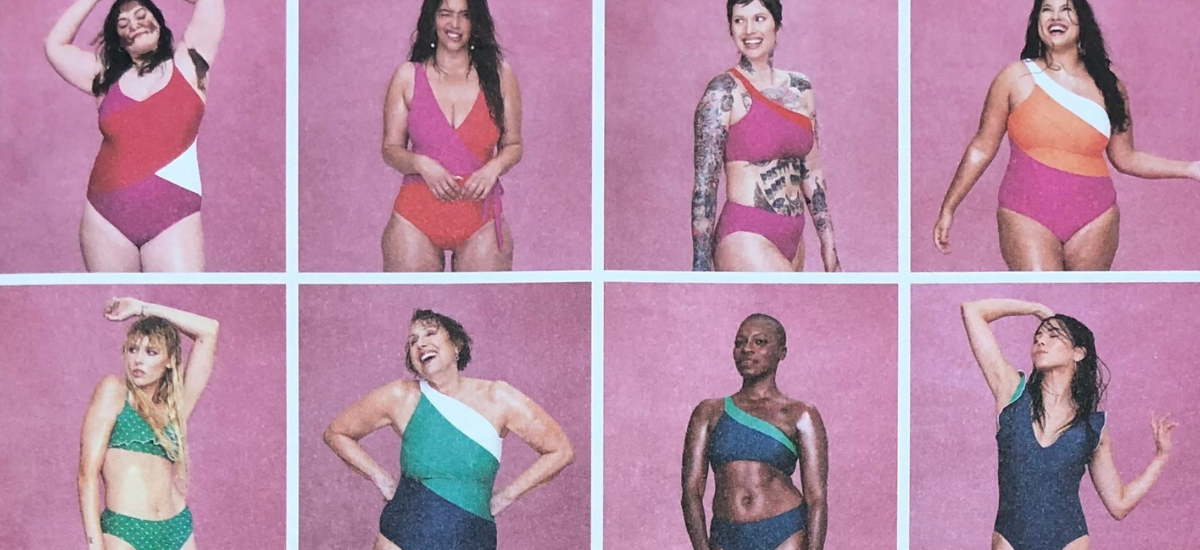
1) EFFORTLESS DIVERSITY
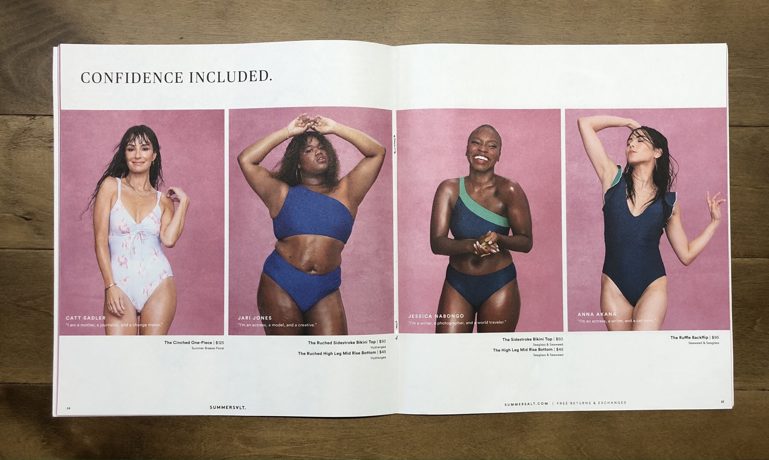
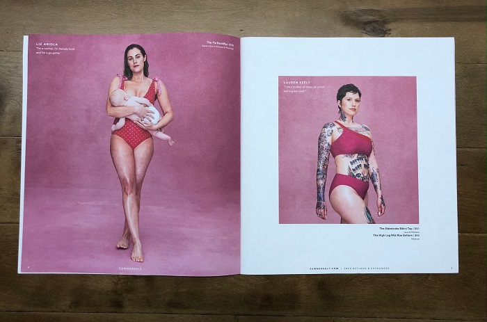
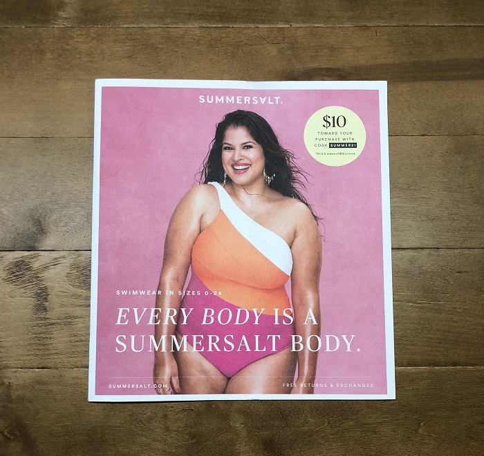
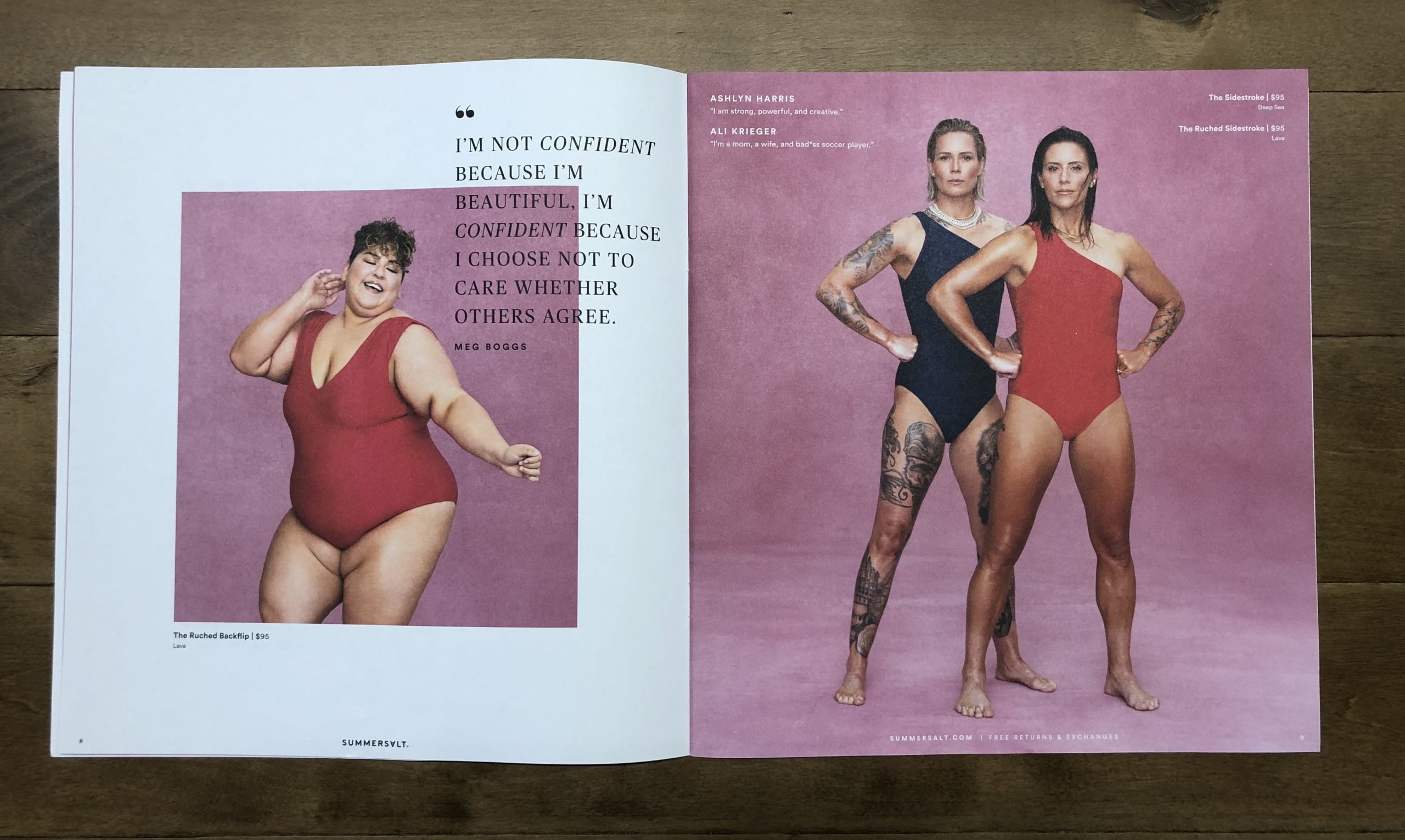
Many brands want to feature different personalities and body types that better represent their customers and the world we live in. Many fall short in this attempt or feel disingenuous doing it. Not so with Summersalt. They make their stand directly on the front cover – “Every body is a Summersalt body” – and pay it off on every page, in every photo.
The women modeling the swimwear are a wide range of ages, ethnicities and body types. These aren’t traditional catalog models. These are real women: strong, honest and confident in their bodies, confident in who they are. Representation matters. And Summersalt proves it.
2) LIMITED BRAND COLOR PALETTE
By using a single background, a textured pink sweep, the brand palette consists of essentially two colors: pink and white. All the models are photographed on a lightly textured pink sweep, which creates a simple, visual cohesion throughout the book. It allows the colors, prints and cuts of the swimwear, as well as the uniqueness of each of the women modeling the pieces, to stand out.
Framing pages in white gives the reader’s eye a chance to rest while establishing a contemporary aesthetic that suits the brand and layouts. By using essentially no other colors, props or elements, the merchandise – and the models – stand out. Limited color, maximum impact.
3) POWERFUL VOICE
With a few carefully chosen copy treatments, Summersalt establishes a clear brand voice. The headlines communicate both quick benefits and inspirational mantras. For example, one headline touts Summersalt’s differentiator, announcing a wealth of sizes ranging from 0-24, backed by scientific data for a perfect fit. In lieu of traditional product copy, we see the names of the real women modeling the merchandise, with “I am” testimonial statements where the women define who they are and what’s important to them.
The voice comes through in the images as well as the copy. The lively energy in the women’s poses and expressions tells the story as well as the words on the page: confidence, individuality, strength.
Three things Summersalt could do better:
1) ONLINE ENGAGEMENT
DISRUPT, DELIGHT and DRIVE are three critical concepts that contribute to a catalog’s success. The Summersalt catalog does the first two incredibly well. It’s the third concept – DRIVE – that could use a jumpstart. While the website is consistently placed at the bottom of each right-hand page for easy reference, the opportunity to add more “drivers” could serve the book well. Strong calls to action compel readers to engage beyond the page.
With so many interesting women featured throughout the catalog, Summersalt could also drive readers to additional content online, either on their website or Instagram page, to read more of the women’s unique stories. It’s such a compelling opportunity to get consumers immersed in the brand, or even to invite customers to share their own stories. One spread calls out more than 250 styles and colors. This could be repeated in several spots throughout the catalog to remind readers to go online to shop the full variety.
The QR code on the back cover is another opportunity to engage. The addition of a simple descriptor – like “scan to shop” – can increase interaction, which increases the chance of purchase.
2) PRODUCT BENEFITS
In the current language of catalogs, long copy blocks are not a necessary component. The opportunity to communicate more information online allows more flexibility in how to treat selling copy on the catalog page. Summersalt uses no individual copy blocks for each product. And that’s completely acceptable. However, it also reveals an opportunity.
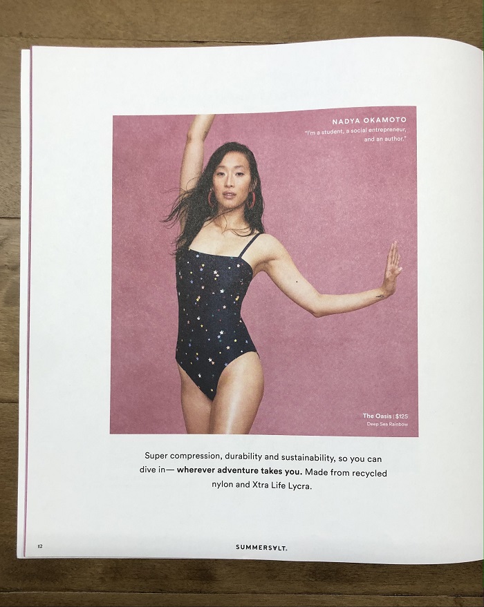
Recycled fabrics, compression, data-backed fit … Summersalt’s swimwear offers these benefits and more, yet these are only referenced in a few places. Since many catalog readers skim the book, increasing the visibility of these valuable selling points, by placing them in a few additional spots in the catalog, can help.
3) ELEGANT OFFER
How noticeable is too noticeable? It’s a delicate balance. Summersalt has a $10 offer with purchase. While the front cover showcases the offer in a simple dot whack, the back cover and inside back spread use a large gift-card-shaped text box with a yellow gradient to present the offer. Though it stands out, it doesn’t fit with the rest of the catalog’s clean, visual aesthetic.
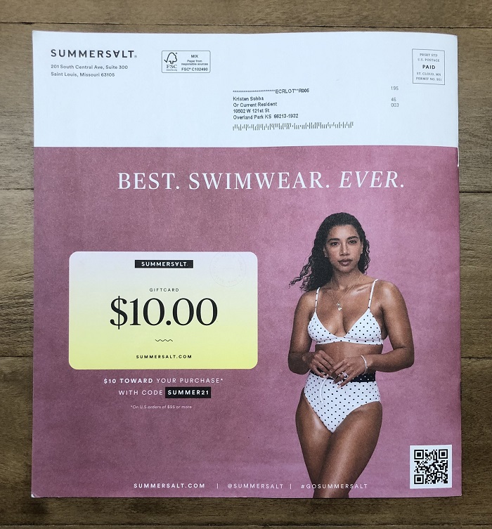
It comes across somewhat loud. And the use of the yellow color, used exclusively for the offer, gives it consistency, yes, but also creates a disconnect. A more complementary color, and a scaled-down size, could maintain the clarity of the offer while conforming more to the catalog’s elegant, visual language.
Summersalt is a perfect example of a brand that “gets it.” They build their story on emotion and inspiration, and support that story with merchandise that delivers solutions to women. The catalog is a strong selling tool: very effective and visually compelling. And it’s also a perfect example of how the best catalogs, with key strategic initiatives, have the ability to be even more effective in communicating to customers and, more importantly, getting them further engaged.
Because even good can always be better.
Read More Catalog Critiques:


Tags: #catalogcritiques, brand voice, branding, catalog, catalog design, Customer Experience, engaging copy, engagment marketing, marketing, Matthew Fey, product benefits