Let’s start with a something that we can all agree on: good information makes all of us smarter. And let’s take another step and agree that well-informed design tends to work harder and perform better. So far, it’s likely we agree on principle. But in practice, I still see a lot of analytics and creative teams that work in silos with obstacles in the way of a free and frequent exchange of information.
We see it in our agency relationships, where we sometimes work on client data but not creative, or creative without data, and find barriers when looking for the results of a campaign we designed, or looking for creative samples to match up with data for analysis.
The creative team must understand the demographics of the audience they are designed for and the differences in how they shop.
I suspect that insane production timelines create the same scenario in internal creative and analytics teams as well.
But sometimes, you just have to make it happen. Here’s a few times when it’s critical that your creative and data teams are talking:
DESIGN EVOLUTION
So many companies today are looking for ways to attract a younger audience. Often, this results in a complete creative makeover to a younger, fresher artistic viewpoint that’s meant to appeal to the coveted millennial audience. However, creative and data teams should coordinate to create a testing strategy that allows analysts to project the impact that the redesign will have on existing customers. In other words, test into it slowly so you don’t watch your revenue suddenly take a dive.
CUSTOMER PROFILE
It’s hard to imagine a scenario where the primary customer profile hasn’t been shared with the creative team, but what does happen frequently is a failure to see context.
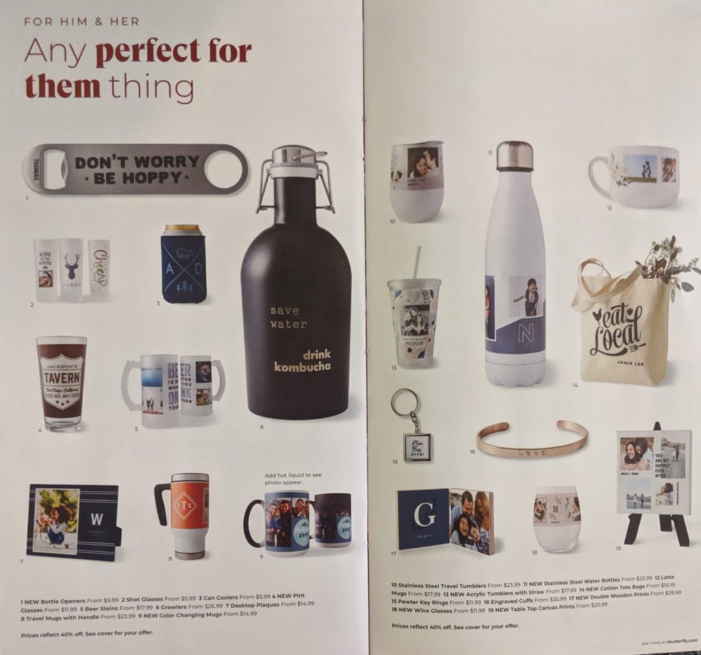
Take this example (below) from a TinyPrints catalog. The copy is stacked at the bottom of the page creating a clean and modern aesthetic that works with a young customer profile. But imagine how this might challenge an older demographic, who will struggle to match a tiny key code to the small-type block below. So the point here is that there’s not just artistic considerations, matching a customer archetype to images that appeal to them, but practical considerations that extend to how products are positioned on the page.

The creative team must understand the demographics of the audience they are designed for and the differences in how they shop.
In a perfect world, the sales information or at least product ranking would have been shared with the designer at handoff.
PRODUCT RANKINGS
Designers are often tasked to create an ad or page without sales information, which puts them at an unfortunate disadvantage.
In a slideshow ad – commonly used for social ads or digital display – a series of images are displayed one by one, like in this example (below) from Etsy. In the example below, the left-most image would appear first. Click data tells us that the first image in this slideshow is the most important, as it gets seen and clicked more frequently.

In a perfect world, the sales information or at least product ranking would have been shared with the designer at handoff. This way when they create the ad, they’d be able to place the best-selling outfit combo as the first slide, increasing the chances of a click and conversion.
Sales data is also incredibly useful to catalog designers, as it’s a guideline for how to organize the categories within a catalog as well as products on a page. Best-selling categories should appear in “hot spots” (front and back of the catalog) and top-selling products should be moved to the top right corner, where the catalog shopper’s eye goes first.
On a web page, it’s the opposite. Eye-flow studies show us that the eye goes to the top-left first and then moves right and down the page, so best-sellers should be arranged left-to-right when designing landing pages.
When a creative team is given a method for prioritizing products and information, the results are going to be more thoroughly thought-out and perform better after launch into the marketplace.
TEST RESULTS
To a data-driven marketer, the speed and agility with which digital can launch and measure results is an astonishing wealth of information. But digital isn’t the only team that can benefit from that wealth of information.
The catalog team often works from data and insights gleaned from the previous catalog drop. So that’s a start, but they should be also armed with the latest intelligence about what’s new and working well online in terms of product sales.
It doesn’t stop there – digital teams should be doing regular testing, and these valuable insights should be shared with the offline teams for true multichannel coordination. I’d caution that customers often behave differently in different channels, so another insight to be vetted rather than a directive.
So, if we agree in theory that data and creative work best when working together, how can we put it into practice? Here are a few steps.
- Make it a policy that data and creative both get a seat at the table at regular meetings. Invite key members of the creative team into the data review, and invite the data people to the creative kickoff.
- Encourage participation and discussion from both sides. Where creative is invited into what’s primarily a data meeting, encourage them to ask questions and offer ideas. Conversely, challenge the data-people on how insights translate to creative presentations.
- Ensure that KPI dashboards cover not just the facts and figures, but always include a review of the creative to put it in the proper context.
One thing is certain: when you get data analysts and creative people in a room, it’s bound to provoke lively discussion. But discovering new information is the best way to learn from each other, build on each other’s strengths and challenge each other – and the status quo.
Need help making data connections to creative? We can help! Email laurena@jschmid.com to reach out.
Tags: creative and data, Data Driven Marketing, Marketing Analytics
