

Lois Brayfield, CEO
The research stopped me cold. And I seriously thought our team had it right … we didn’t.
Let me back up to the beginning. At J.Schmid one of our mantras is that catalogs should DISRUPT, DELIGHT and DRIVE. I’d like to focus on the latter. Catalogs should DRIVE customers or prospects to DO something. In most cases, the goal is to drive readers online to either investigate products, explore for more or hopefully purchase. Intuitively, most consumers understand this and don’t need the prompt IF they are ready to buy.
Catalogs are a powerful tool and when produced well, should work in concert with your website or store messaging to encourage activity. Thus, we develop CTA’s (calls-to-action.) Now, I would say we do a darn good job at this but recent research using heat-mapping tools (see below), proved we needed to think about our “online drivers” a little differently.
Enter CustomInk. This is an awesome company with a unique proposition. They have an online design lab allowing you to create custom-designed t-shirts (and other cool products.) The catalog is clearly meant to be a driver, used to quickly explain what they do and then drive online traffic. Unfortunately, the options vary so dramatically they cannot include pricing. So, including CTA’s is extremely important. On almost every page, we included a bright orange box, prompting readers to go online to see more, get pricing, experience the design lab, blah, blah, blah.
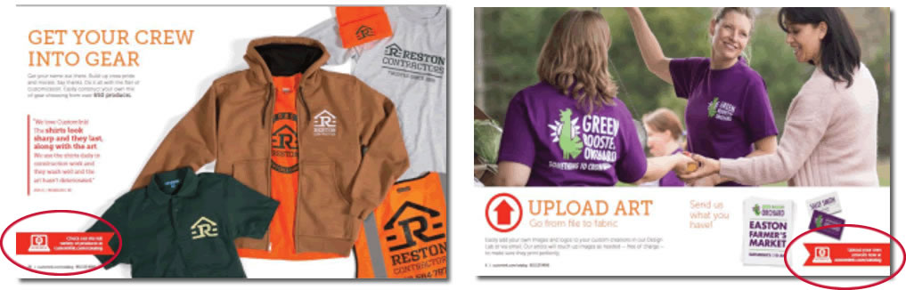
Custom Ink Catalog Spreads with Online Callouts
And unfortunately, we might as well have used “blah, blah, blah” for the CTA’s. Because this is such a tricky situation, research was important to prove that we were getting it right. And for the most part we were, and what we learned was fascinating! Customers loved looking at people’s faces. It was often the first thing they viewed on every page. Second, they like looking at the product and the design included. And they read the headlines along with some of the copy. No surprise there. Awesome.
But, what they DIDN’T look at, EVER, were the carefully crafted, boldly orange, well-placed, not-to-be-missed CTA’s found on almost every page. Ouch.
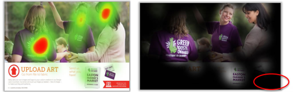
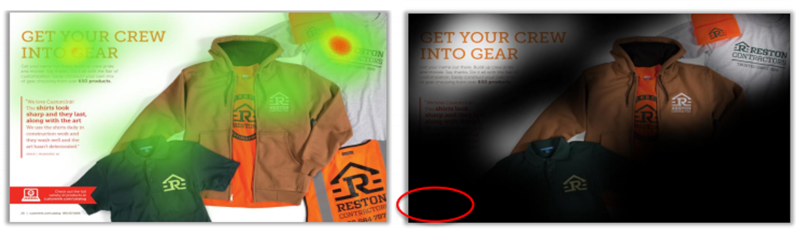
Custom Ink Spreads with Heat Mapping
Why did this happen? We now believe the orange boxes were just white noise, ignored because the customer intuitively knew we were just selling to them. And, we had too many of them! So, our strategy has shifted to the following:
- Only include a CTA when you are truly explaining something unique and relevant to THEM.
- Place CTA’s next to items we KNOW they will be looking at. In this case, next to a person or a product and NOT in an editorial-looking box.
- Create CTA’s that truly engage in something they would like to do, not just self-serving directive notes.
The big take-away is to never assume just because you include something loudly and repetitively, the customer is going to look at it. You can’t force human behavior. But, you can learn from it and adjust.
How about your catalog? What important messages do you include that might be considered “white noise?” What techniques do you use to DRIVE customers to activity? We believe it’s critical to get this right and we are going to continue to test our theories. You should too!
Need help? I’d love to talk about it, give me a shout! Call 913-236-2402 or email loisb@jschmid.com.
Tags: call-to-action, catalog design, heat-mapping, Research