Lois Brayfield, CEO
Amidst all of the inbox clutter, one thing gets easier every day — swiping to delete email on our mobile devices. Most of us do it daily or even several times a day. We sit poised, device in hand, trigger finger hovering at the ready. We scan, we process, we either tap to open or swipe. Boom … gone! And there’s a certain delight that comes when you “clean up” your inbox.
More people than ever check their email on a smartphone or tablet. In fact, mobile email open rates have grown 180 percent in the past three years. On a smartphone or tablet, email opens represent between 43 percent and 53 percent of total email opens depending on who you ask – different providers have reported slightly different results.
However, mobile clicks and conversion rates continue to lag far behind desktop. In fact, mobile has the lowest conversion rates of any other device. Small screen sizes, lack of optimization and the complexity of the purchase path are the most oft-cited reasons for eschewing mobile devices in favor of desktop.
Therefore, it’s more important than ever to be direct, impactful and make the most of a tiny allotment of space.
Let’s start with an often neglected aspect of email marketing: the mobile inbox view. It’s the first thing users see, and often the ONLY thing before an email is swiped to the trash bin by a ready trigger finger.
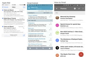
Below are three screenshots to illustrate the variation that’s typical across mobile apps. These are incredibly popular apps from powerhouses Apple and Google. From left: Apple Mail, Gmail, and Inbox by Gmail.
Do you see the subtle differences? Unfortunately the number of characters allowed in the subject line are different. The subject and from line are always shown, but in different order. And Apple’s default mail app includes HTML links as opposed to the teaser copy that’s included in Gmail’s apps.
So, what’s a marketer to do? Here are three tips to improve your mobile open rate:
- Craft shorter subject lines. In general, when it comes to subject lines, shorter is better. In fact, really short is better! As you can see, all three of these popular email formats truncate at about 30 characters. And it’s even worse for those consumers (like me) who choose a larger type font. For me, it truncates at 20 characters! So you write 28-character subject lines, right? Not quite. According to an October 2014 study by Mailer Mailer, four character to 15 character subject lines have the highest open rate. Therefore, keep it as short, sweet and simple as possible. You’ll stand out in the inbox compared to your long-winded competitors.
- Use an instantly recognizable “From” line. This isn’t the place to be clever. Your from line should be the shortest recognizable iteration of your company name, as opposed to an email address. If it’s from an individual, it should also include the name of your company. I recently deleted what could have been a great offer from American Eagle. I thought it came from American Express because all I saw in the from line was American E…
- Have a pre-header that complements your subject line. The pre-header is simply the first line of text that appears in your email, and it frequently appears just after the subject line. Take a look at the first screenshot using the Gmail app on Android. Note how both Mint.com and CVS waste valuable characters repeating nearly the same message, while Houzz.com makes the most of its character space by following the compelling subject line “11 Reasons to Love White Bedding” with the call to action “Discover what’s new on Houzz this week…
Another area in which mobile languishes behind desktop is clickthrough rates. Once your message has avoided the dreaded trash bin and a consumer actually takes the time to engage your brand, how do you encourage consumers to take the next step?
- Try responsive design. You must have a responsive email template. MailChimp found that unique clicks amongst mobile users rose from an average of 2.7 percent to 3.1 percent, a 15 percent increase, by using a responsive email template. The first link in responsive emails on mobile have a 30 percent higher clickthrough rate than nonresponsive emails. There are a ton of free and low-cost options out there; just Google “responsive email template.” MailChimp users also have access to responsive templates with an easy drag-and-drop interface. If you’re being courted or considering moving to a different email service provider, this should be easy to negotiate as an incentive.
- Use large, dramatic images. Large, dramatic images pull subscribers into an email. We’re visual creatures, and large images with dramatic angles and proper lighting make us sit up and take notice. Masters of this technique include TOMS and Everlane.
- Make text size readable and tap targets easily accessible. Consider the size of the screen and make tap targets easy and spaced a reasonable distance from each other. Furthermore, make the text readable. This should be a given in your responsive template, but test across platforms to ensure a good user experience.
We’re at a tipping point in the world of email marketing, where half of the total email opens across the globe happen on a mobile device. The rapid proliferation of smartphone use is a fast-moving freight train, and marketers must keep up. Those who make mobile optimization a priority across the board have a small window left to surpass the competition and stand out in a cluttered inbox.
Tags: email marketing, email mobile optimization

