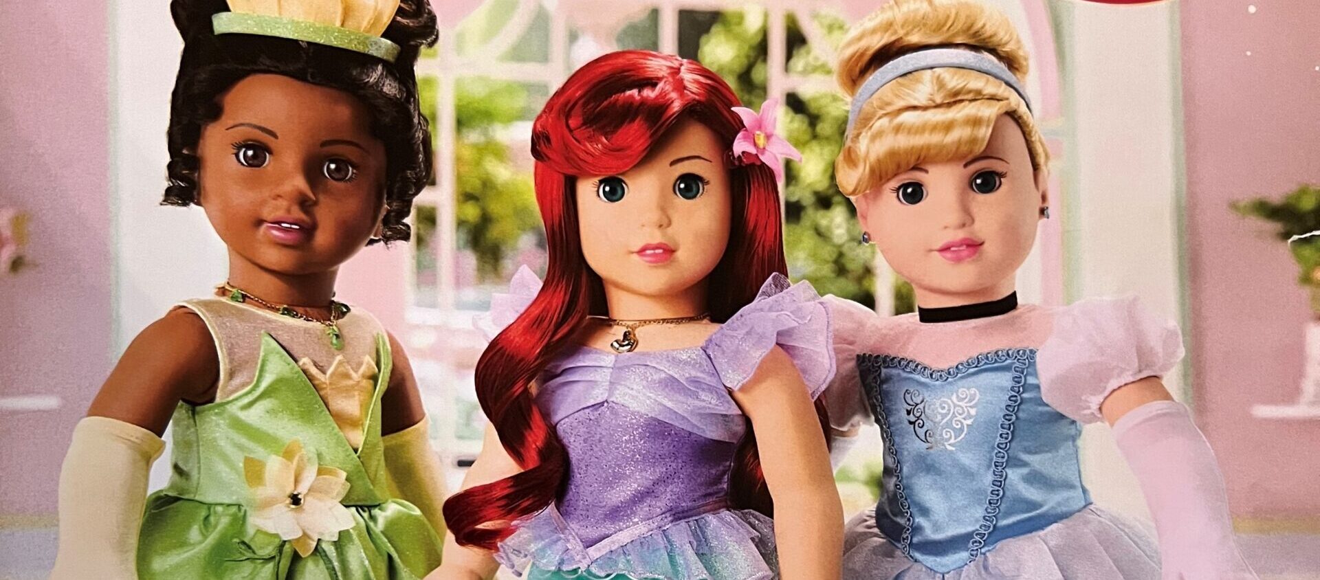
It’s 1997, I’m in the third grade and Christmas is just around the corner. The anticipation of Christmas starts weeks before, carefully crafting my wish list to send to Santa (who I’m not sure I still believed in, but presents were at stake!). The top item on my list? An American Girl Doll. Girls at school were starting to get them and their catalog showed up in our mailbox. I remember treasuring that catalog and flipping through it every day, reading the stories and circling which doll and outfits I wanted.
The American Girl Doll catalog has the same nostalgia for me as when “someone older” (sorry, guys) references the Sears Christmas catalog. And when it comes to marketing, nothing tugs at the heartstrings quite like nostalgia. When used correctly, it’s a powerful tool that invokes sentimental memories driving customers to capture those feelings and relive past experiences.
Last year, someone gifted my 3-year-old a bitty baby, an entry level American Girl Doll for ages 18 months+. Since then, we’ve been getting the catalog in the mail. Every time it arrives, I feel the same rush I did when I was eight years old. I flip through every page and daydream about the day when my child is old enough to receive her very own doll.
A few things have changed since I was eight years old and through my experience at J.Schmid I view catalogs through a more strategic lens. Let’s look at three things American Girl is doing well and three things they could improve on.
1. Inclusivity
The American Girl Doll catalog does so many things right. In the beginning they started with a small handful of dolls but have since grown their offering with a commitment to creating dolls and accessories that reflect the real world with a variety of skin tones, eye colors, hair styles and textures. They have specialized items that include service dog gear, wheelchairs, diabetes kits and hearing aid placement.
While the most recent catalog I received included a variety of dolls with varying hair and skin tones, it missed an opportunity to include specialized items, like hearing aids or a wheelchair, that would really make a difference for their customers who require the same specialized items in their day-to-day life and make them feel seen in the catalog.
2. Storytelling
Pleasant T. Rowland, the founder of American Girl, based her whole brand on combining great stories with aspirational characters in hopes to inspire the next generation of girls to do great things. In a catalog I was able to find from Holiday 1997, each doll received 3-5 SPREADS (not pages, SPREADS) telling their story. Holy cow! While that catalog was 122 pages long, we simply don’t get that storytelling opportunity anymore. Storytelling is at the heart of who American Girl Doll is. And while their March 2024 catalog is only 48 pages, there is a lack of storytelling. They have a lot of headlines and sub copy, but I am missing some of what sets American Girl apart from other doll brands. If they could bump up the storytelling a bit more I think they’d hit millennials right in the feels with nostalgia.
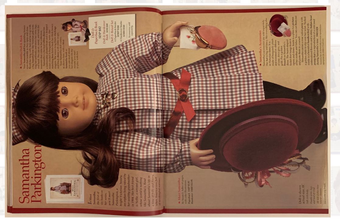
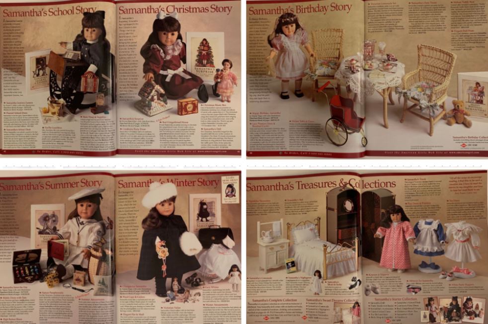
Images from Toys and Collections Museum
3. Images & Page Hierarchy
American girl has great images, I love that they’ll show a combo of girls interacting with their dolls, but also feature the dolls in environments based on their clothes and accessories. Those are the images I loved seeing growing up, the dolls at a slumber party or in the classroom. Now, they’ve really taken it to the next level, with a full horse and barn set up, or the train station from Harry Potter (hello nostalgia for millennial parents!). It really allows the customer to dive into the world of imaginary play and showcases all the accessories that will bring it to life in your own home.
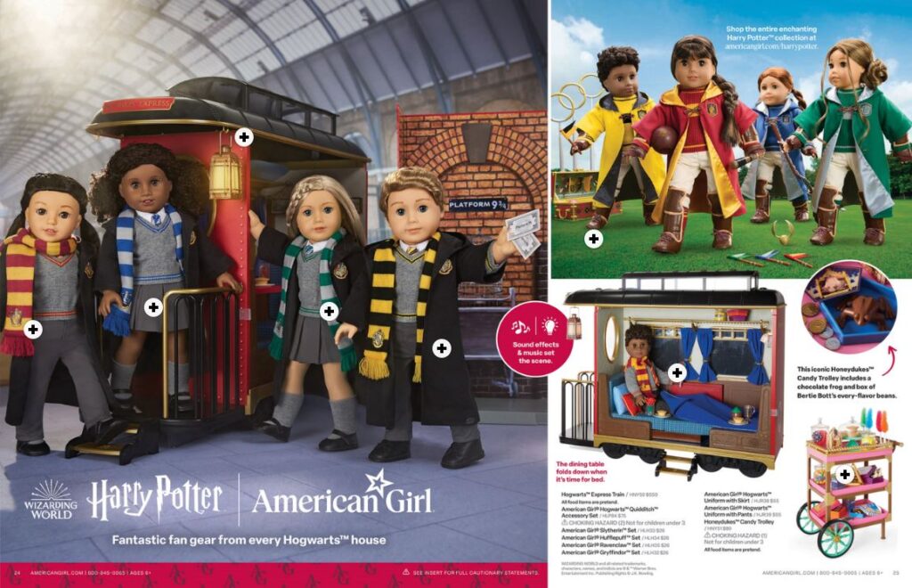
Image from American Girl Doll
And while the images do a great job at telling the story, I think they could work on hierarchy a bit more. For example, on this Spring/Easter spread, there is a lot to look at. The human brain loves simplicity and organization. Reducing the amount of headlines and subheads and streamlining product copy could help the customer process the information on the page in a more efficient and engaging way.
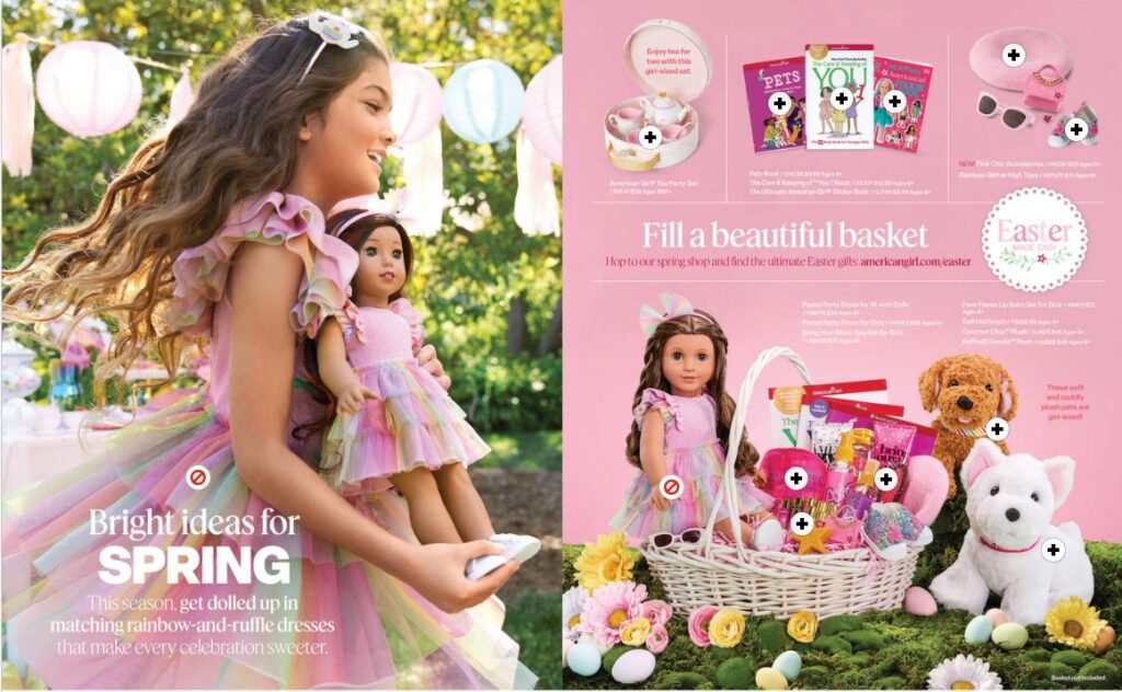
Image from American Girl Doll
The American Girl Doll catalog still resonates with me all these years later and while they do so many things right, if they could amp up the specialty accessories, add more storytelling and adjust the copy hierarchy they’d really have a home run in the mailbox. And, if they’re ever looking for help with their catalog, I’ll be first in line to volunteer, with the Samantha doll I received at Christmas in 1997, tucked tightly under my arm.
Want to do a deep dive on your favorite American Girl Doll and accessories? Give me a shout at shannons@jschmid.com, I could reminisce for hours.
Tags: Brand Storytelling, catalog design
