Catalogs are a visual medium. This fact has not changed – even in a world where everything else seems to have evolved.
This is good news for the catalog industry! According to recent science, the brain processes visual information 60,000 times faster than it takes the brain to decode text. Why is this? We understand visuals faster because they affect us both cognitively and emotionally. They increase comprehension, recollection, retention and have the ability to affect our imagination, emotions and attitudes.

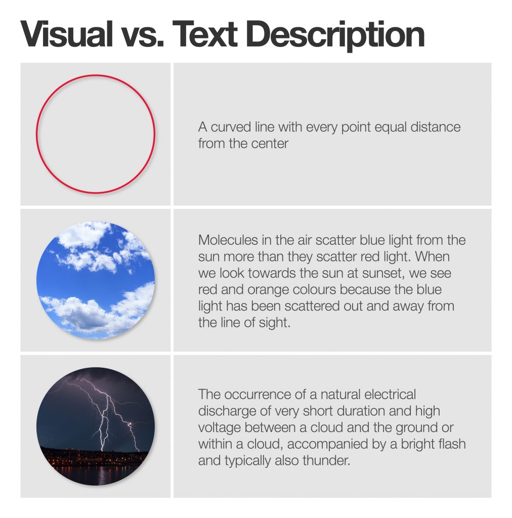
Need proof that visuals are a faster way to get an idea across? We chose a few simple concepts, and then paired them with a text description. Verdict: the images can convey the idea in an instant.
Catalogs, when sent to the right person with the right merchandise assortment, should be like eye-candy to the beholder.
Should be.
Unfortunately, too many marketers ignore the science and go for the easy route of throwing up a lot of product images on a page with little thought to how the viewer might actually process a spread. Yes, I said marketers because let’s admit it; designers are driven by budgets, deadlines, density and an ethos of where catalogs fits into the marketing eco-system.
The landscape of visuals presented in your catalog should create an efficient and effective piece of advertising IF you consider the following:
- People buy things because of the way it LOOKS, what it DOES or how it makes them FEEL. When choosing a photograph to best represent a product, gravitate towards the one that best answers this question. For instance, if a products true value is in what it does, be sure to show it doing that unique thing. This often requires a second photograph and that’s perfectly fine.
As I’m sure you’ve heard, 90% of our purchase decisions are based on an emotional need. For those products that deliver an emotional need, choose imagery that demonstrates that value.
For many brands that deliver on either an emotional or aspirational need, including a dash of lifestyle imagery will give credit to the rest of the product shots on the page. Use these wisely!
- Use imagery to create uniqueness. We know that catalog shoppers are looking for something new, unique or better yet, something exclusive. Photography or graphics that demonstrate this will not only grab attention but most likely increase response. What imagery can you add to your products or catalog that will give the sense of uniqueness?
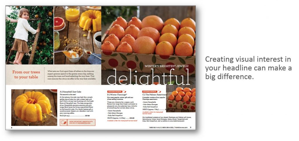
- Copy can be visual! That’s right. The placement and size of a few highly emotive words can become imagery that quickly conveys a mood or sentiment. Short headlines are underrated and can be a powerful selling tool when created as a visual element.
- Avoid visual cramming. You know what that means … cramming as many visuals as possible on a spread. Nothing grabs attention and nothing is processed by the eye. While there is a time and place for high density spreads (as a way to add pacing) too many will literally cause eye strain.
Catalogs provide an incredibly unique opportunity that many other forms of advertising do not. When carefully designed with human behavior in mind, you have the opportunity to tell a more complete story for both your brand and your products.
Need help creating a more dynamic catalog that disrupts, delights and drives activity? Email me at loisb@jschmid.com
Tags: catalog design, catalog photography, catalog visuals, Lois Brayfield

