Lauren Ackerman, Web Content Specialist
You only need to do two things to have a great website.
1). Make shopping your website as intuitive and simple as possible.
2) Tell the story of your brand and your unique selling proposition, without interfering with the above.
Simple, right? Riiiiiiiiiiiight…
In search of that elusive combination, I found three eCommerce websites that tell their story without compromising the “shopability” of their sites. Each of these has a signature element that they execute particularly well. On top of that, they all have one thing in common. Let’s start with the former.
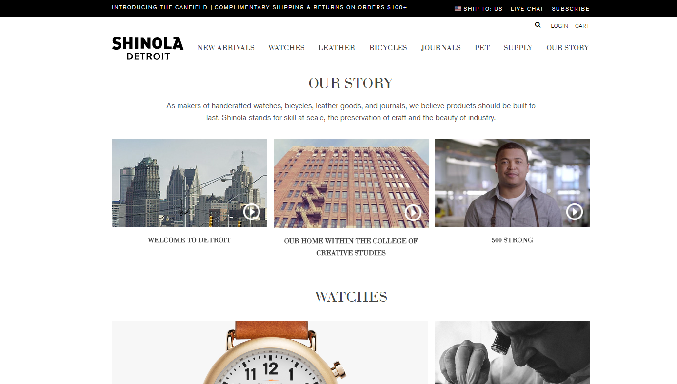
Who they are: A Detroit-based company that sells high-quality handmade products, and is known for its watches and leather goods.
What their site does best: Integrates well-crafted branding videos.
The site opens to simple, spare photography of their flagship, handmade watches, and quickly follows with new and exclusive products. Directly beneath those products is a set of three videos. One features the city of Detroit, its deep roots and nostalgia for “the glory of manufacturing.” It shows skilled tradesmen at work in their factory along with sweeping views of the Detroit skyline.
A second video introduces us to Shinola’s home within the College of Creative studies, showing us that the company not only makes well-made goods, but is design-focused as well. And all of this is in the heart of this gritty, hardworking American city.
Finally, a third video introduces the factory workers in jumpsuits, jeans and t-shirts, looking into the camera and introducing themselves by name and trade. No professional models here, just hard working people proud of their attention to design and detail.
The videos are evocative but spare, nostalgic but contemporary. They evoke a period when the best products were made in Detroit, a thriving hub of manufacturing and clearly establish that Shinola is an American story of craftsmanship and design.
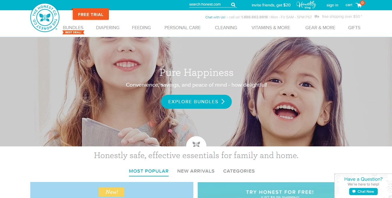
Who they are: The Honest Company is a fast-growing ecommerce business that sells safe-and non-toxic family goods like laundry detergent, diapers and sunscreen.
What their site does best: Imbue the brand message throughout the site rather than limit it to a small, designated area.
They use a few carefully chosen, powerful words throughout the website: “Honest”, “pure”, “safe,” “peace of mind,” “Together, we can make it better!” Every section includes these brand-imbued words so that the message is never lost.
They do this while using an intuitive, familiar navigation structure and easily accessible site search. At the same time, the home page features their popular products and current offers and easy access to cart info and live chat.
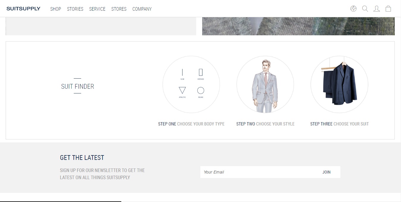
Who they are: A men’s fashion brand that sells one-of a kind custom-tailored suits.
What their site does best: Proving their brand message with the content designed to speak to the cool customized-just-for-you suiting options.
While the competition is saying, “We’ll help you find your perfect fit!” Suit Supply puts that idea into action with a fit-guide and suit finder by body type and style.
The “About our Suits” page is also chock full of great video, close-ups of the stitching and lining. A combination of images and copy are used to show the differences in lapel style and fabric between contemporary and formal suit styles.
…
In addition to what these three brands are doing right, there’s another thing that they all have in common: strong, evocative, on-brand imagery.
Each one of these websites has a clear viewpoint that’s conveyed through a combination of photography and the site design itself. From their choice of setting, to the look and mood of the models to what they are wearing. Your understanding of who they are starts when you arrive at the top of the page.
Shinola leads with its products, featured in a clean and simple design. It uses mostly non-professional models – factory workers, wearing their work jumpsuits at work in the factory. The imagery is wistful – rough hands in black and white, or nostalgic low-contrast filters.
The Honest Company shows you a snapshot of smiling kids, bathed in bright natural light, or of a happy moment between a parent and child. In their words, “Pure Happiness.”
Suit Supply is polished, using professional models looking immaculately cool to evoke interest and desire.
Website shoppers aren’t going to process those intricacies of lighting, model selection and setting on a conscious level, but they will understand it intuitively. And they’ll walk away with a sense of each company’s space in the marketplace.
Online shoppers arrive at your website most often because they have a want or need, and you must not get in the way of what they have come to do. But with careful craftsmanship, every choice you make on that page can make the emotional connection that will keep them coming back.
Need help designing a website that also sells? Email me at LaurenA@JSchmid.com or call 913-236-8988.
Tags: branding, ecommerce, web design


