Logo Evolution or Logo No Go?
Redesigning a logo is a monumental task not meant for the faint-hearted. From the font choices to the use of graphics to choices of color and style, this critical piece of a brand identity conveys much about your brand at a glance. So, it’s important to spend time and attention consideration for each choice.
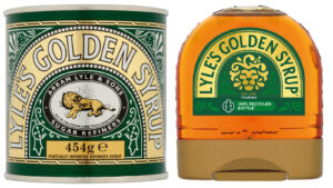
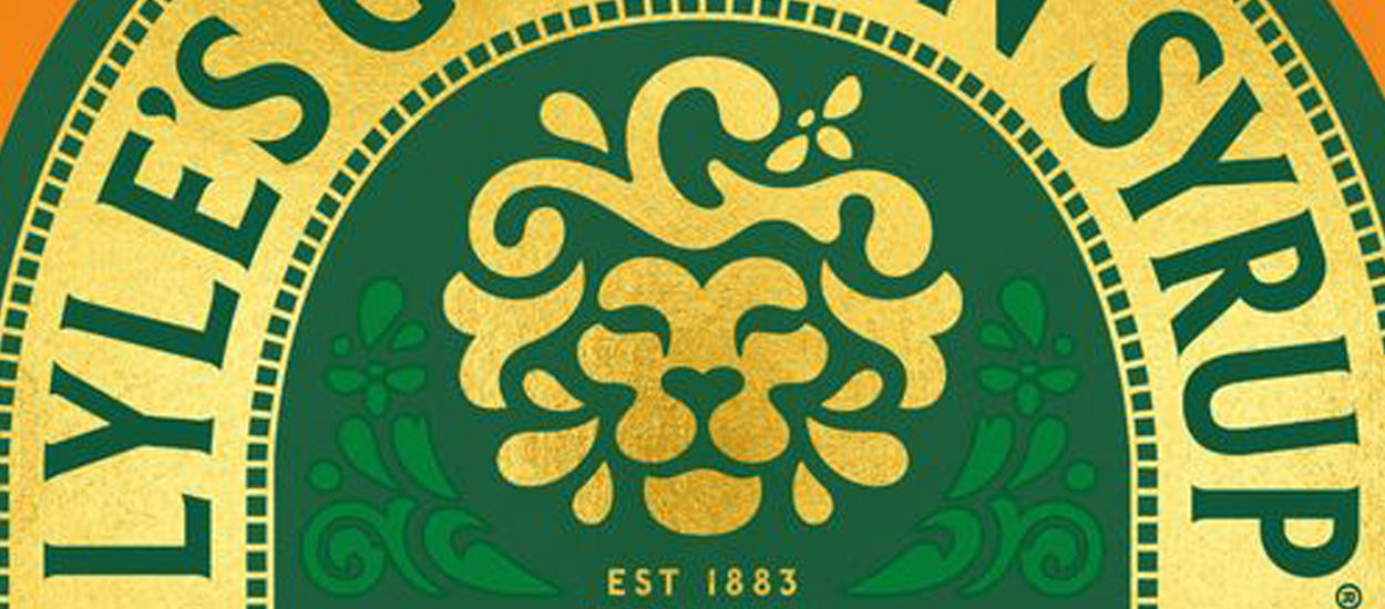
Recently, a UK brand made history with a logo update. What made it noteworthy? In 2006, the Guinness Book of World Records recognized Lyle’s Golden Syrup as the world’s oldest unchanged brand packaging, making their redesign the end of a 140-year-old reign. Feedback on the redesigned packaging was not kind, with commenters comparing the new logo to a poorly designed Starbucks knockoff.

The harsh criticism raises the question: should they have changed it? What makes a redesign necessary? What should a brand consider when updating?
First, let’s start by looking at two well-known brands whose logos are easily recognizable: Coke and Apple.
The Evolution of the Coke Logo
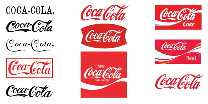
Coca-Cola has had at least 11 logo changes since its inception as Pemberton’s French Wine Coca in 1886. The following year a new logo for its non-alcoholic version was developed, and in 1887 its logo was changed once again to the now familiar cursive design we know and love, but there were still more changes to come. Along the way, the brand made many variations to reflect the times and culture, at one point adding rhomboid diamonds after both C’s.

Today’s logo uses a variation of the original hand-penned Spencerian script crafted by Coca‑Cola inventor Dr. John Pemberton’s bookkeeper and partner, Frank Robinson.
The Evolution of the Apple Logo
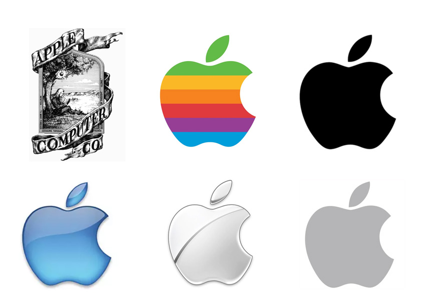
Next, let’s look at Apple. Since its inception, Apple has changed its logo seven times. Apple’s first logo was a rectangular block featuring Sir Isaac Newton sitting under an apple tree, with the fruit dangling by the narrowest thread. Other changes occurred in 1977 (rainbow stripes), 1998 (in iMac colors), 1999 (translucent), 2001 (monochrome plastic), 2007 (metallic), 2015-current (flat black). Apple logo revisions came during the introduction of new products or when updating software. As they did when the switch from Classic Mac OS to Mac OS X occurred.

Design tastes change as time moves forward. Since Coca-Cola was invented in 1886, major design eras have come and gone in popularity: Art Nouveau, Early Modernism, Bauhaus, Art Deco, Brutalist, and Pop Art have all come and gone. Coca-Cola and Apple are two examples of iconic brands that updated or evolved their logos throughout the decades to reflect changing consumer tastes and aesthetics.
In both examples given above, the logos, once established, don’t change dramatically, but they are refined throughout the decades. The logos have been tweaked to reflect the times and to engage the buying public.
Which leads us to three key points:
1) Tastes change with the times.
2) A logo redesign is not necessarily starting over, it is renovations (Evolution not revolution).
3) Redesigning your logo on a regular basis will keep your customers in tune with your marketing.
Updating your logo is an essential tool and should be in your arsenal. Styles changed, and so did Coca-Cola’s logo. The Coca-Cola logo is an example of a living, breathing reflection of the tastes and culture.
When is it time for a logo redesign?
When we look at both examples from Coca-Cola and Apple Inc., the updates and changes seem to reflect the company’s new direction or the changing times. The 1889 Coca-Cola logo with rhomboid diamonds is playful, and the new selection of a script font reflects that and breathes new life into it. The evolution of the Apple logo often coincides with new product launches, such as the colorful iMac lineup released in August of 1998. Or when they introduced the iPhone in 2007.
Back to Lyle’s Golden Syrup: its original logo was a scene from the Bible, a dead lion surrounded by bees. At one time, Lyle’s Golden Syrup carried the Royal Warrant on its tin canister to signify its status supplying the monarchy. With that insignia on their product, it made clear that it was good enough for King George V, thus giving them a leg up on the competition.
With this rich history connected to the brand, it’s understandable that Lyle’s Golden Syrup hesitated to launch a redesigned logo. But the question becomes, while the symbolism may have been clear once upon a time, do shoppers today understand it? Do they connect with it? Do we really want a dead lion on food packaging?
At the end of the day, we shouldn’t ask Lyle’s Golden Syrup why you changed its logo after 140 years. We should ask them what took you so long?
Tags: logo redesign
