
Familial, Authentic Sunnyland Farms

If you’ve never had the delicious pleasure of curling up on the couch with a Sunnyland Farms catalog, you’re really missing a treat. Sunnyland Farms is family-owned and started as a mail order company in 1948, providing gourmet Georgia Pecans, Nuts, Chocolates, Dried Fruits, Candies and assorted gifts. Now, they’re online and shipping to tens of thousands of customers around the world from their farm in Albany, Georgia: the heart of Pecan Country. I’m a huge fan of Sunnyland Farms. I love supporting a company that is family-owned and quality-focused. I admire that they are both farm and manufacturer; so you know your order comes right from their hands to yours. And I’m in awe of the genuine regard and loyalty they have for their work family.
As far as their catalog is concerned, I imagine (and hope, but don’t know) that it performs well for them. A catalog needs to stand out and garner attention; pay off that attention with content that creates desire, and – ultimately – compel customers to click, call or visit. Said differently, it needs to Disrupt, Delight and Drive. But it’s tough to put this charming catalog through the paces of our usual assessment exercise. Like their company, the Sunnyland Farms catalog is unique compared to catalogs we’re used to seeing in the mail these days. It feels like reading a Willson Family holiday card: it includes snapshots and updates from the whole family. There is also a picture of every employee, and for some, a little info on what they do for Sunnyland Farms. The catalog is home grown. It almost transports you back a decade or four with its layout.
How would one critique this catalog? It’s likely not had a professional designer’s attention, yet it is also beautifully unfettered. Is it possible to overlay some simple improvements onto a catalog that is so steeped in its roots and still maintain the authentic, familial brand?
First let’s take a look at three things that are really working for the catalog.
1) Know your farmer.
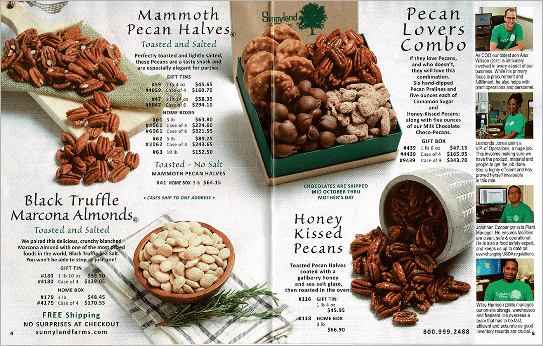
As a business, Sunnyland Farms is a powerful illustration of the concept of “Know your farmer, know your food.” With southern hospitality, the Willson family welcomes you to the farm to meet the people that produce everything they sell. And the catalog follows suit. Since 2018, the right hand column of every spread is dedicated to celebrating the employees—the ‘backbone of their company’—their roles, their value and their loyalty. The back pages are more heavily covered with three generations of this years’ family updates. You are not just a customer perusing a catalog, you are an old friend being offered ‘long-time favorites’ and new items, too. By the time I’m done going through the book, I want to order the chocolate-covered pecans and be invited for Thanksgiving. This book seriously sets a new bar for brand likability.
2) Owning the look.
All the photography for the catalog is done at the farm by Todd Stone, who has provided both his talent and his friendship to the family for over 25 years. Friends, it works. The images are mouthwatering close-ups—imperfections and all—of everything from fruit cakes to pecan clusters, shot in a relatable, unpretentious style and in everyday dishes we all probably own.
3) Information? Yes please.
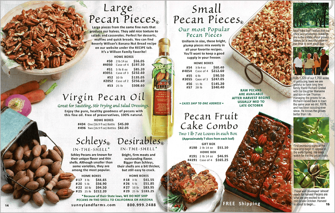
The Sunnyland Farms offering is vast, both in breadth and depth. From sweet to savory, gifts to self-purchase, snack sizes or by the case, the catalog delivers order options every size and way possible. Today, most catalogs send us online for all the nitty-gritty information. There is something refreshing in having all the information right there on the page. It feels right, here. It’s brand-right, somehow. (Not to mention helpful. And a great idea-generating tool for volume gift-giving.) They’ve also done some brilliant mix-and-match “Do-it-yourself” bags. All right there on the page.
If I’m being honest, though, there’s some work needed for the Sunnyland Farms catalog to upgrade the reader experience. Let’s take a look at three easy opportunities for improving the book while still maintaining its affable nature.
1) Less is more.
In general, the products, features, information—even the employee callouts— would be easier to absorb with a cleaner design. The copy is too big (I can say that. And I’m old.) and too horsey. Product images and copy run too close together such that it’s hard to delineate. Overly-tracked headlines and centered copy blocks bring a sense of disorganization. Pulling back on the noise will actually make the products stand out more, not less. Bring the copy down a size or two, simplify the typeface usage. Left align the copy blocks and price grids for easier reading and better eye flow. And consider giving everything a little more space to breathe. White space is okay.
2) Democracy is bad (in catalogs, I mean).
It’s counter-intuitive, maybe. But we need imbalance in order to have balance. We need visual hierarchy in order to see everything. We need hero products and scale to understand better the value of each product. We need the copy to speak boldly when necessary and then whisper when appropriate. In the case of the Sunnlyand Farm catalog, everything right now is equal. The products are often the same size, and spreads are laid out the same way page after page. The large copy headlines are all shouting. Because the design doesn’t offer hierarchy, everything is battling for our attention. Let’s mix it up a little to keep the reader’s interest. How about a hero spread with a single best-seller peppered throughout the book for visual relief? Then a few grided, high density spreads that work a little harder. And thinking about arranging the products in a more dynamic way, that shows scale and lets the eye focus on the product.
Although not a visual device, another area to inject some differentiation is to consider adding descriptive names to the products. We’ve actually experienced a client that went from generic food products to named products (think ‘Fruit Cake’ becomes ‘Grandma’s Legendary Fruit Cake’) and sales skyrocketed.
3) Losing the forest through the trees.
The employees—the backbone of the company—should be celebrated in the catalog. And it feels right that we’re allowed a peek into the Willson family news. It makes us feel a part of things. But I’d suggest that we’re losing the forest through the trees. The detail, and dozens of individual photos and the real-estate dedicated to all the employees and family stories somehow becomes a visual ‘white noise.’ The deep-dives we’re invited to take at the individual level have us missing the larger brand expression. Is there a way to demonstrate the importance of the company’s people, and honor them, in a more singular and impactful way? Perhaps a dynamic group photo of the whole company or family on the inside back spread instead of individual photos on the back cover? Perhaps there are other ways to integrate the employees: can they provide testimonials or favorites? They deserve a place in the catalog; but can it be done in a more centralized way so that it doesn’t fight with the product?

By focusing the employee stories in a more centralized way, valuable spaces in the catalog can be better leveraged. The back cover of a catalog is also prime real estate; it’s a catalog ‘hot spot.’ Even if your customer opens the mail and puts the catalog directly in the recycling bin, they will see the back cover. So in putting all the employee headshots on the back cover, Sunnyland Farms is also missing an opportunity to get compelling product in front of their customers.
The Sunnyland Farms story—the brand’s “Why Us”—is a beautiful one. Rich with history, hard work, exceptional product and a genuine loyalty the family and employees share with each other, and with the customer. It’s a story that deserves to be told.
Need help understanding catalog best practices? Contact Micheled@jschmid.com.
Read More Catalog Critiques:


Tags: brand story, branding, catalog, catalog critiques, catalog design, Customer Experience, engagment marketing, Michele Drohan