Why You Should Keep It Simple
“Simple is harder than complex.”
–Steve Jobs
Browsing through a catalog of one of my favorite brands, I found myself completely frustrated, to the point that I eventually threw the catalog aside. Why? Because they made it hard for me to shop.
We are in an era where keeping things simple is crucial to the customer experience. According to a Harvard Study, over 7,000 consumers said the single biggest driver of “stickiness”, by far, was decision simplicity. In other words, brands that create a simple shopping experience (from beginning to end) have a much greater chance at closing the sale.
Case in point? Amazon. They own simplicity. True story: I was sitting with my husband and friends at a restaurant and we laughed at how many 20-somethings were decked out in man-buns. I impulsively decided my husband needed one and literally within minutes I found a clip-on bun on Amazon. With their “one-click magic” the accessory was on its way. So simple.
So, back to my catalog story. While I’m not crazy about pointing out deficits of one of my favorite brands, I’m going to share a few challenges I had with my new Athleta catalog.
First, on the page above, I was intrigued with the olive jacket (on the right) but wanted to know the price and if it came in black. The subsequent eye-juggling required to find this information was too much for my 50-something-year-old eyes. Designers, pay attention! It might look cool to bunch all the copy together in a long line-length, use small type size and hide it at the bottom, but it’s hard to read, hard to navigate and is not customer friendly. I gave up before finding my answers. Lost sale.
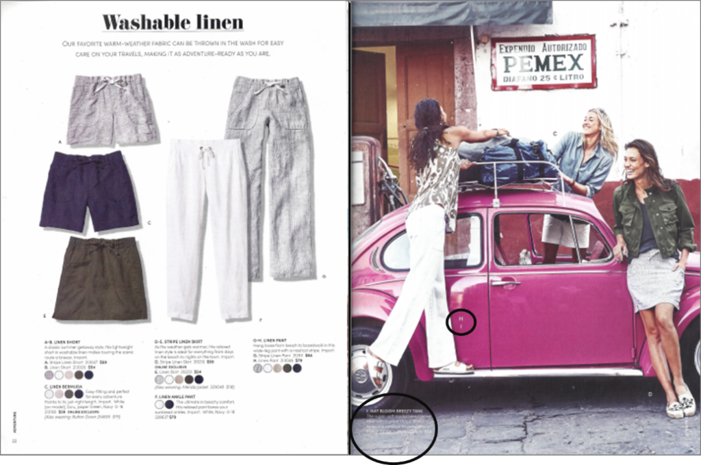
One more example. On this spread I was drawn to the printed tank the model is wearing. Try as I might, I could not find any description. As a catalog specialist (not as a consumer) I was determined to figure this out. I finally found the key designation towards the bottom of the page (not near the actual product). And after scouring the page, finally found the product copy reversed out, barely visible, at the bottom of the page (I’ve circled both the product key and copy.) I defy anyone with 20-something-year-old eyes to find it any faster.
I sincerely don’t think any of us try to create a difficult decision path. It’s just that we are often so darn close to the process we can lose sight of the importance of simplicity. As Steve Jobs once said, “Simple is harder than complex.” And he’s right. It takes a true craftsperson to create a catalog that allows the customer to shop seamlessly.
Key take-away: Once your catalog is designed and copy is in place, have someone completely outside of the process pore over and read every page. This goes for your website too. You’ll almost be embarrassed by how many simple fixes will create a more seamless shopping experience. In a world where simplicity is expected and demanded, you really don’t have a choice.
Oh, by the way, my husband has never worn the man-bun. I think my cat ate it.
Looking for a simpler customer decision path? Call 913-236-2402 or email me at loisb@jschmid.com
This article is also published at Catalog University, where you can find more webinars and blog posts by Lois and other industry thought leaders.
Tags: catalog design, Customer Experience, Lois Brayfield


