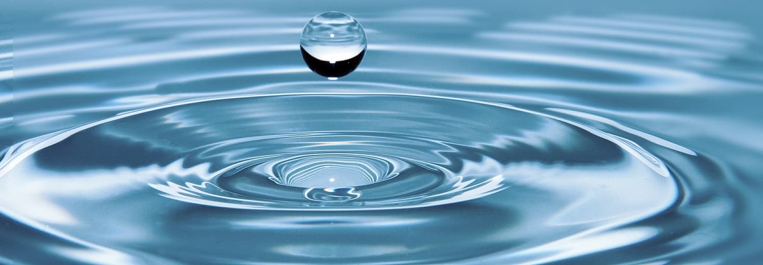

Are you thirsty for better creative? You don’t necessarily need to dump everything and go back to the well for a complete redesign. Sometimes all you need is a refreshing splash of H2O .
Water? No, not that kind H2O . This kind of H2O …
Hierarchy.
Hygiene.
Organization.
How can these three elements invigorate your design? Let’s dive in.
We know from neuroscience that the human mind craves order. The easier it is for people to process elements on a page or screen, the more likely they are to linger, to engage, and to purchase.
When applied with purpose, Hierarchy, Hygiene and Organization (H2O ) combine to give your customers a thirst-quenching dose of good design and refresh your creative presentation without starting from scratch.
A complete redesign can be costly and time consuming. Before embarking down that path, see what H2O can provide some reinvigoration:
HIERARCHY
This is how to distinguish what’s important and help readers navigate your presentation. Humans are visual. The eye always seeks out imagery first. So photos, illustrations and graphics almost always rank as the most prominent item in your visual hierarchy.
Create a hierarchy be establishing about ranking items on the page and screen in terms of A, B and C. Not everything can have an A-level presentation. Establishing a clear hierarch of, “Look at this first, look at this second, look at this third,” give your design a sense of order that people can follow.
HYGIENE
Cleanliness. Consistency. The hallmarks of good hygiene. Good design hygiene is an art that’s often taken for granted. Are the spaces between photos consistent? Is your copy leading (the space between each line) consistent and comfortable to aid readability? Are your copy line lengths manageable? If they’re too long, they take a physical toll on the eye and hinder the reading experience. Are you avoiding hyphenated word splits at the end of lines? Are you eliminating widows? Are you lining up elements in a clear way? These little production details go a long way to smoothing out the overall presentation and making your design clean and inviting.
ORGANIZATION
Everything in its right place. Organized grids. Logical placement of images with corresponding copy. Quiet the chaos. When you’re not sure how to properly layout something, simpler is always better. Like order, our minds also crave simplicity. The easier it is to process elements on the page or screen, the better you’ll be. Of course, that doesn’t mean you can’t be inventive with layouts. You absolutely can. But if you’re looking to refresh your design, it’s best to start with the basics. Work in column. Work in grids. Vary layouts within, but always strive for organization.
H2O can be the secret to pour new life into your design. It quenches the thirst to revive your brand while satisfying the reader’s desire for a sparkling visual and verbal refreshment that the eye and mind crave. Drink it in.
Tags: Design Hierarchy, Design Hygiene, Matt Fey