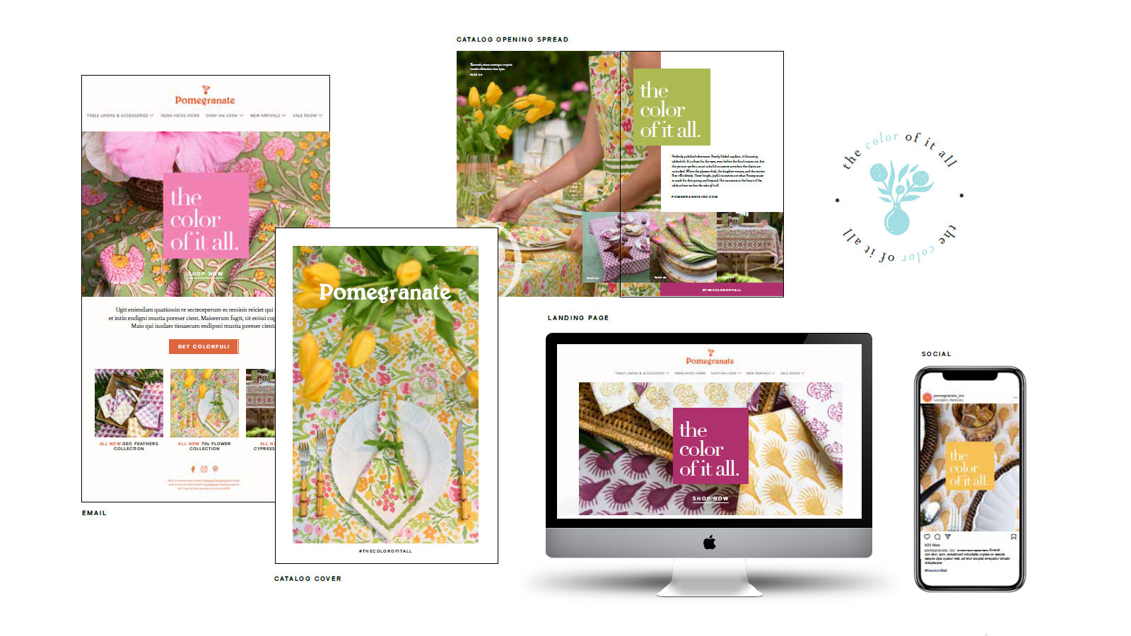
Embracing Versatile, Vibrant Color
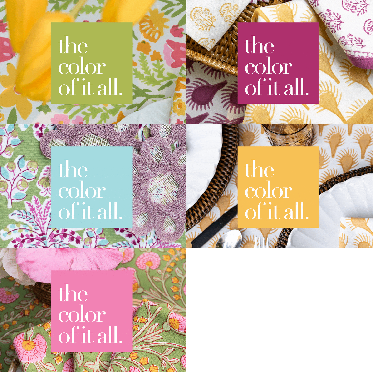
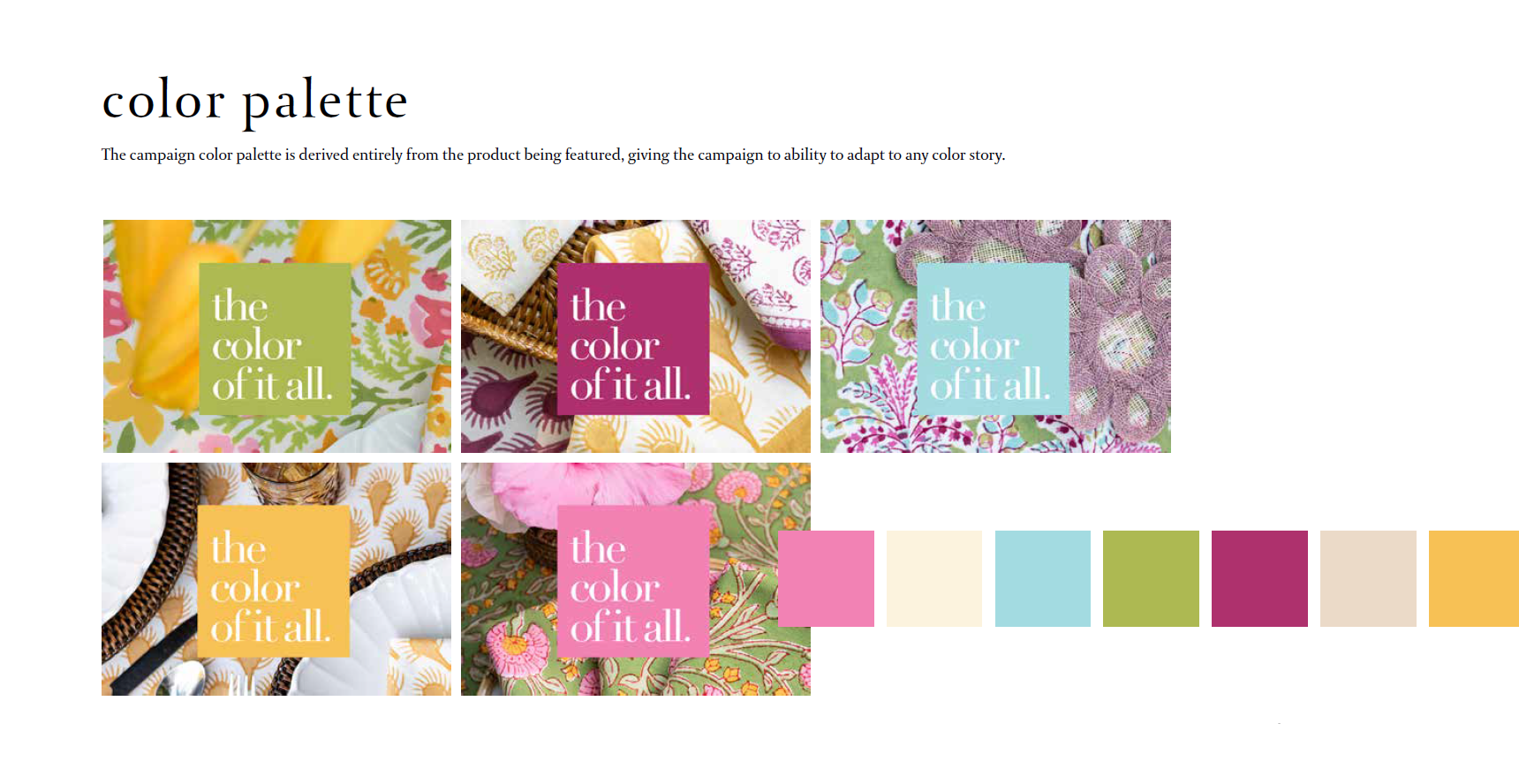
One of the biggest hurdles was Pomegranate’s extensive use of color and pattern. Instead of trying to limit the palette, we embraced it. We designed the campaign to adapt to different seasons by featuring colors that matched the time of year. For instance, spring had greens, pinks, and yellows, while fall showcased browns, dark greens, and oranges.
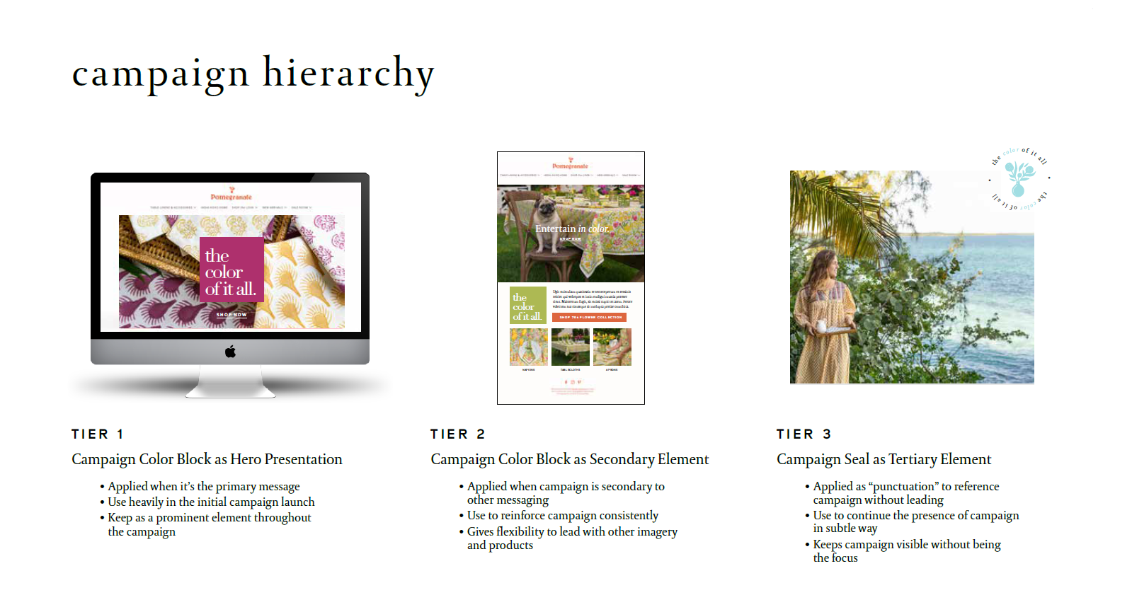
To make the campaign versatile, we created a tiered presentation approach. This included a primary element with a color block as the lead, a secondary element with a seal or circle, and a subtle visual support element. This tiered strategy allowed the campaign theme to be used prominently or as a supporting element across various marketing materials, keeping things consistent without overwhelming the existing content.
Ad Campaign Development: Copywriting | Photo Art Direction | Mock-ups: Email, Social Media, Catalog, Landing Page


